

MSI Chicago
Museum of Science and Industry of Chicago
Rethinking, redesigning and improving
the website of the great & famous
Museum of Science and Industry of Chicago
/01 Context
- Strategy
- Design
- Web
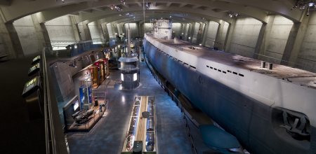
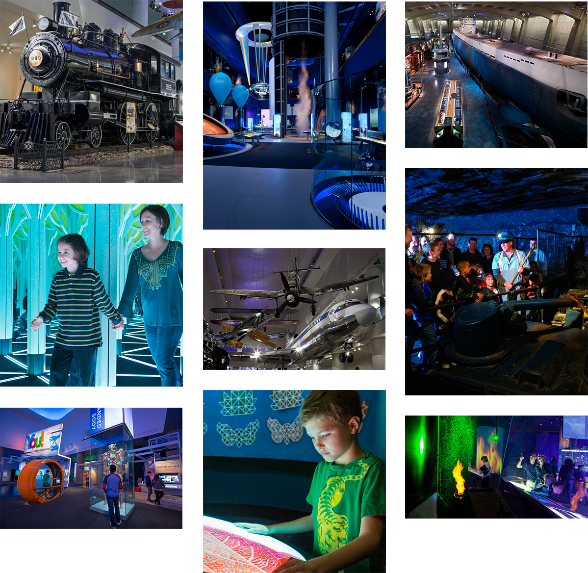
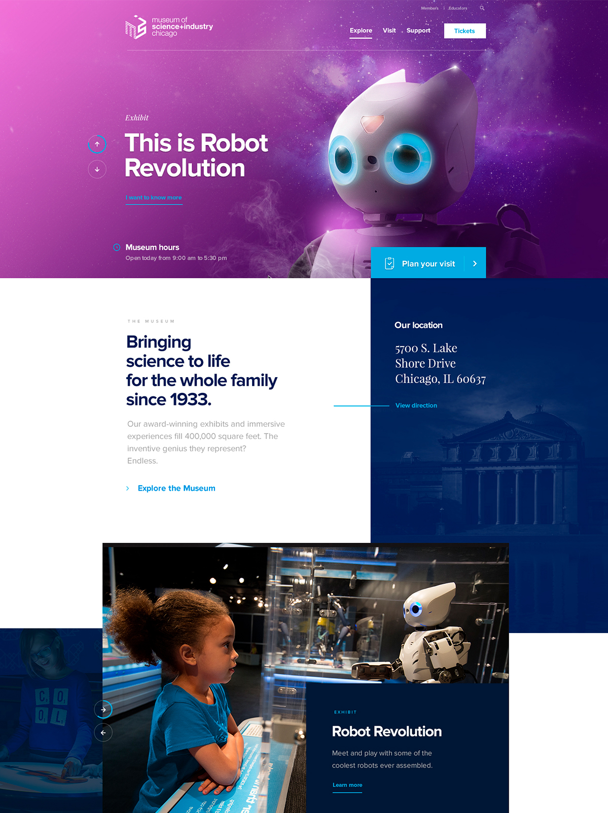
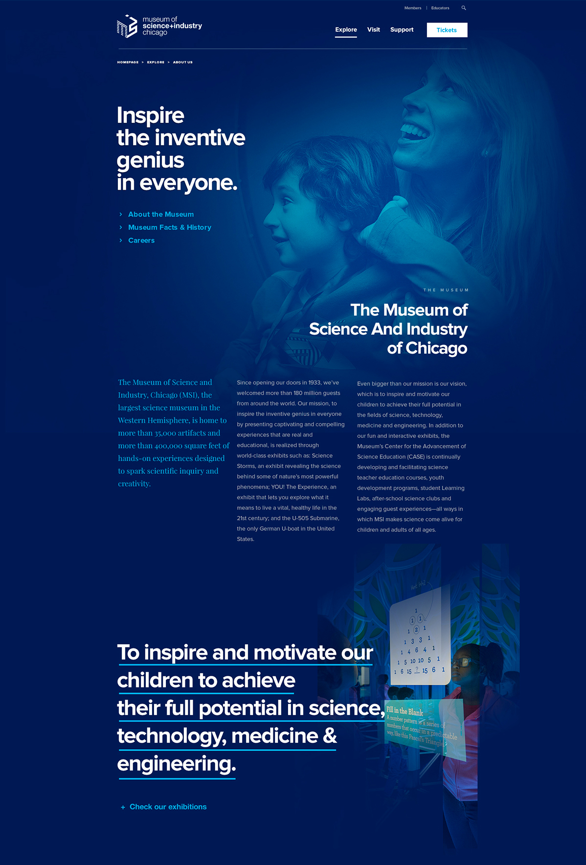
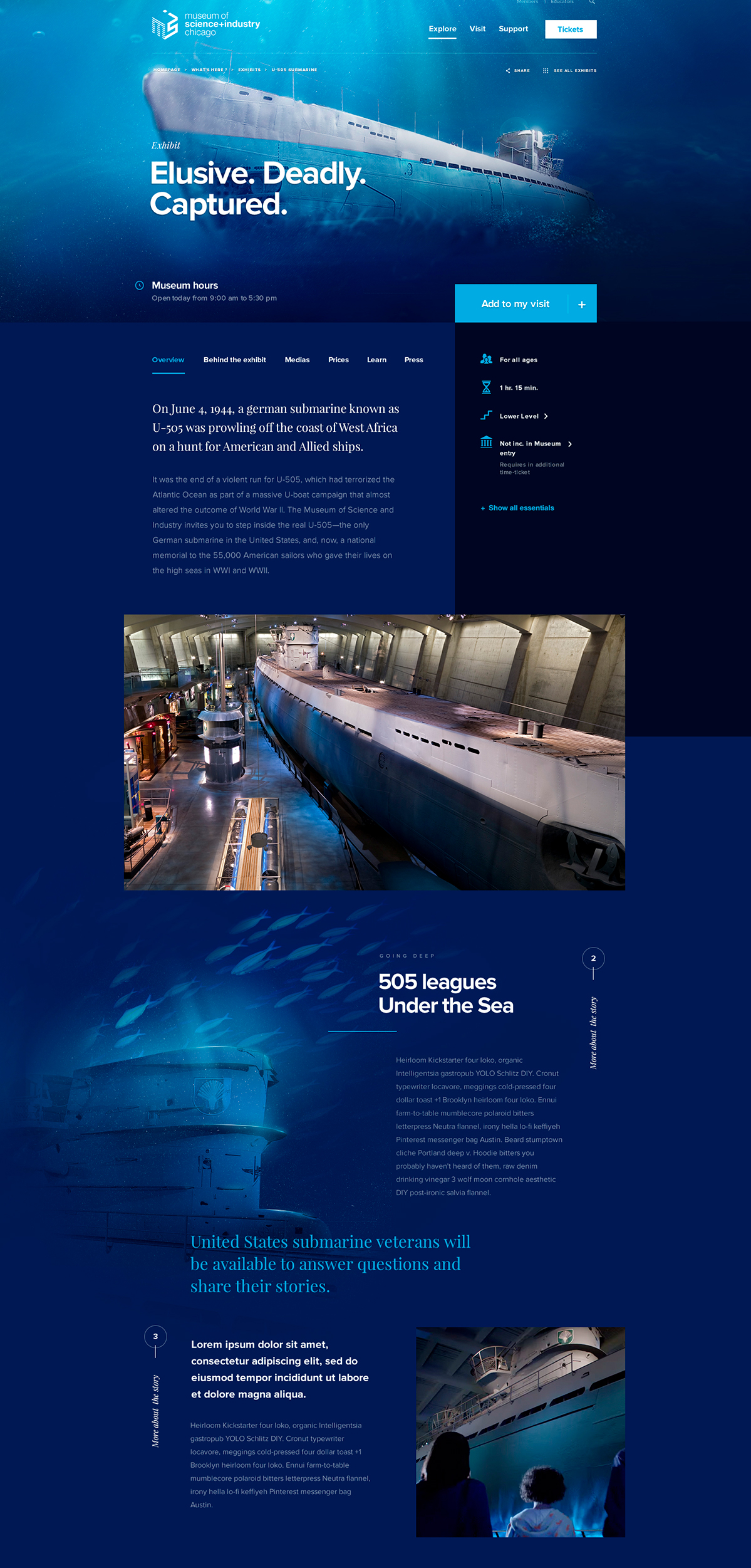
Imagine a place as big as 400.000 square feet, full of amazing wonders such as an indoor real-life tornado simulator, or a full-size and authentic WWII German submarine. We’re talking about a place where kids and their entire family are not only allowed to touch what they see but are even encouraged to experiment everything they can. Yeah...what a difference this is considering what most other museums’ experiences are like
Now, what were the odds that this emblematic landmark of Chicago would pick Dogstudio to entirely rethink and revamp their aging web-platform? Well…stop trying to figure out the math: they were pretty low. It was nevertheless our immersive, emotion-induced-but-still-user-focused approach which enabled ( lucky ) us to start a lasting relationship with this highly respected American institution.
/02 Challenges
Status update : It’s complicated
First of all: seek and destroy – convince and seduce. Our primary goal was to convey directly on the website, the same feeling of awe and amazement we have inside the actual museum, and we’re not only speaking about immersive exhibit pages but also about getting the best value out of the MSI’s content.
When you’re counting more than 5 million annual online visitors, you may want the website to act as the perfect companion before and after your guests’ visit, with everything ranging from buying your ticket to planning your visit, through a series of relevant information about exhibit, schedules, parking, and so on…
/03 Experience
The extraordinary journey of a regular customer
After a few days of workshoping to gather all the crucial information we needed to get started, we focused on several main angles.
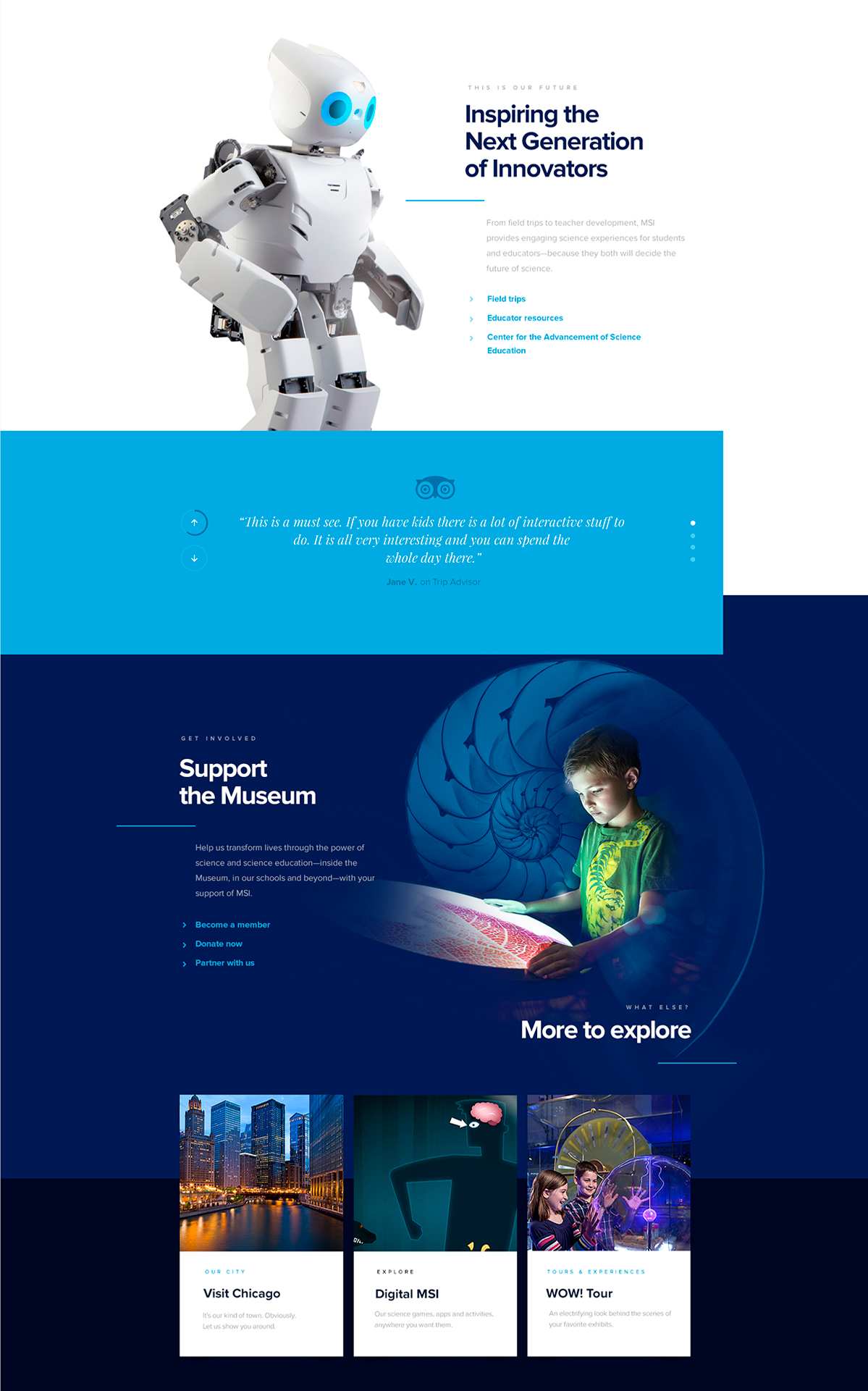
On one side, we worked on the creation of a simple, but comprehensive user experience for a really broad set of potential visitors ranging from super moms ( aren’t they all?) having to figure out how to feed their newborn in the museum while retaining their own sanity, to couples on a honeymoon trip trying to milk every single minute of their last day in Chicago before heading to their next destination.
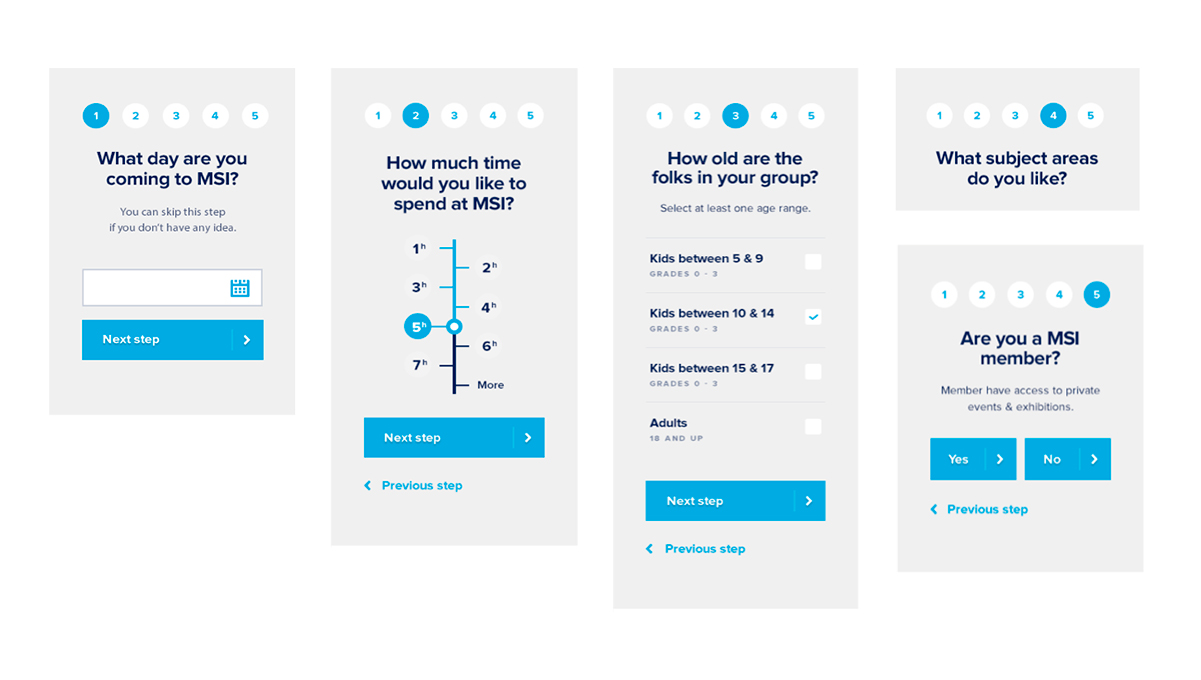
All those customers, with their own very specific needs had to be provided with the right tools to understand, plan, and purchase their experiences in the Museum.
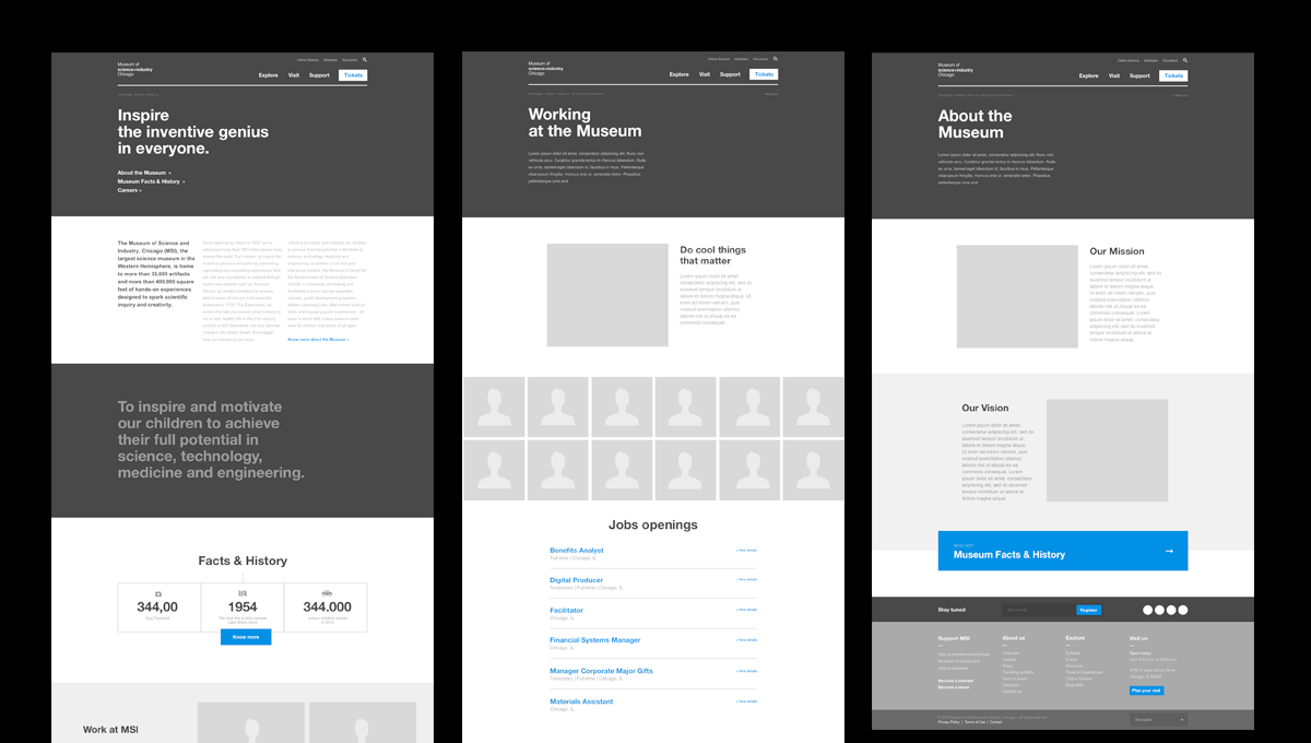
/04 Illustration
Leave a mark
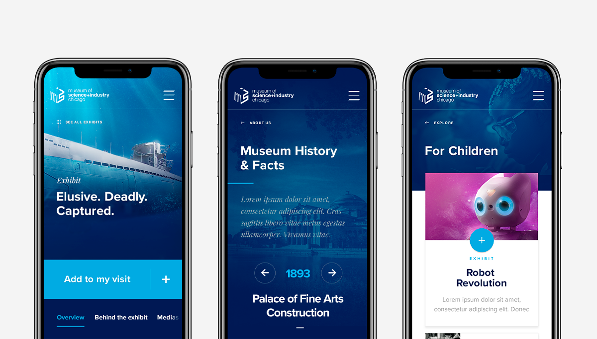
If life gives you lemons, make lemonade, but when it decides to give you raw pictures of a U-Boat, you have to focus on putting together engaging illustrations representing the most major exhibits in movement, all in an inspiring context. This is how we created a series of illustrated cinemagraph to represent all major exhibits. Those illustrations would later be used as headers for all exhibit pages.
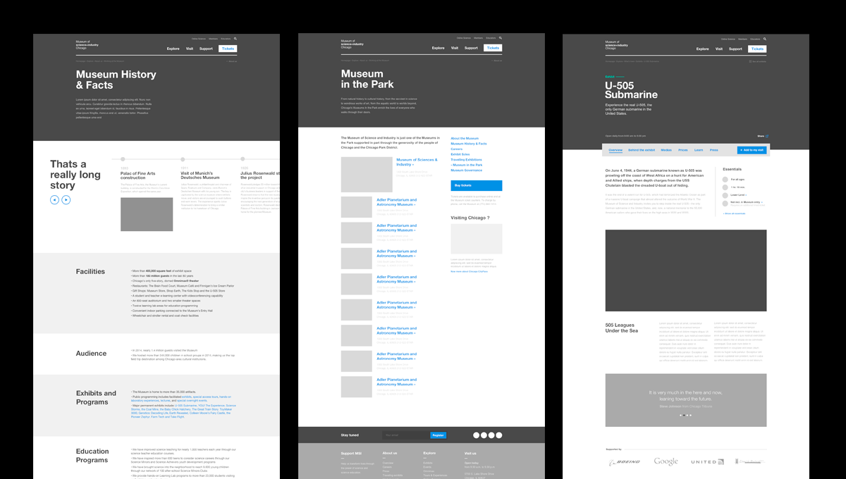
/06 Exhibit Pages
We love it when a plan comes together
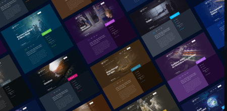
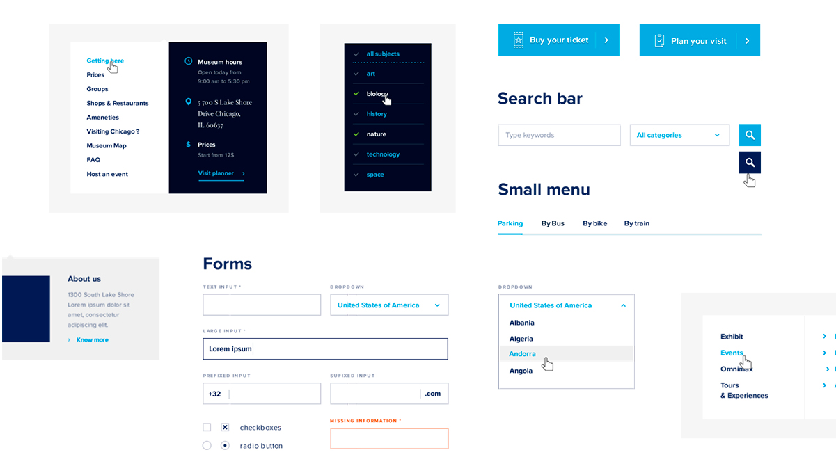
A big chunk of our energy got spent on carefully crafting highly immersive exhibit pages while building a design language which is both consistent and understandable. Starting from scratch, we had to make sure the elements we were building made sense when it came to delivering on a large-scale platform, and regarding a large number of potential customers. Moreover, we knew those pages would later be fully CMS manageable, extending the challenge to a whole different scale.
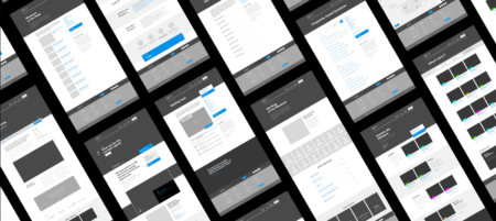
/07 Mobile
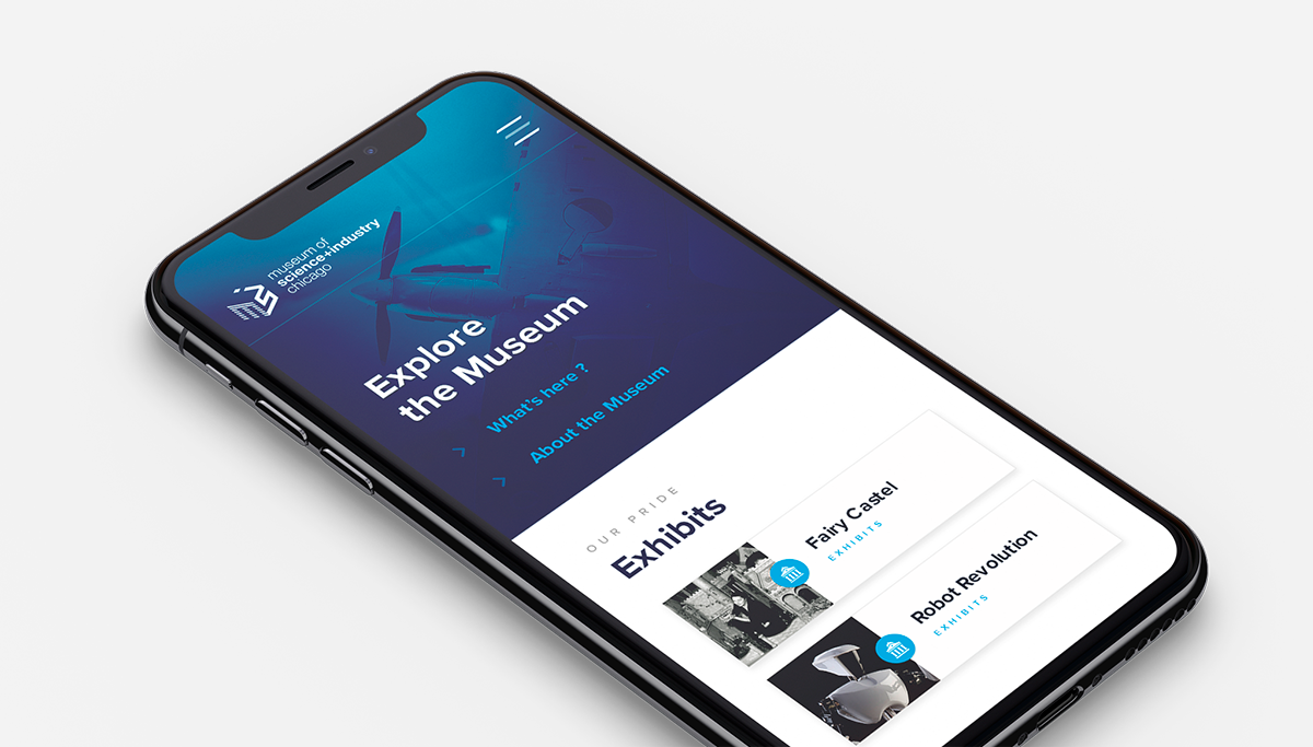
Always on the go
Of course, all the content and all the experience was not only optimised for mobile, but was also clearly imagined and crafted to ensure the same immersive experience you would get on desktop. More than ever, the tools we built needed to be easy to use and accessible too.
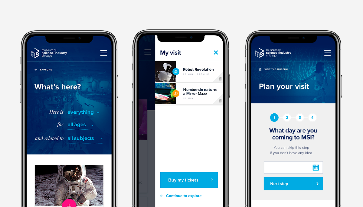
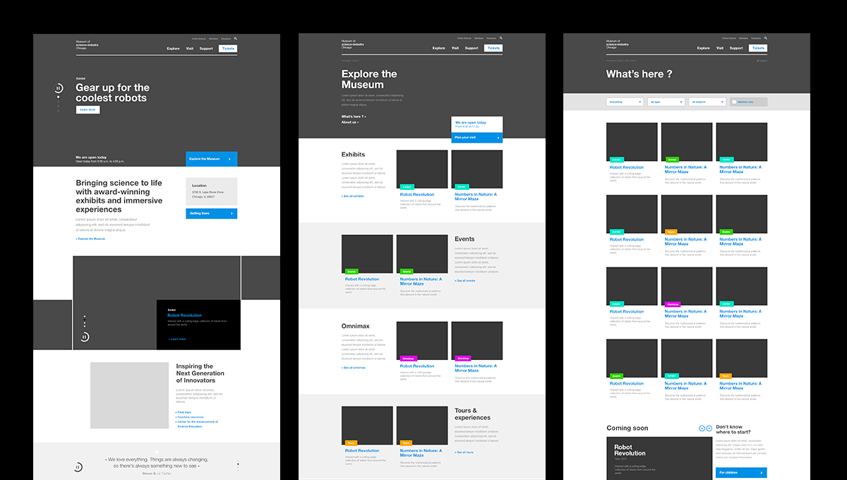
/08 Content
Gimme the right tools
Finally, the website also displayed a wide range of smaller and bigger tools to enable any visitor’s needs to be answered. Planning your visit, while sorting out the kind of content you wouldn’t want to see, and skipping lines in the museum by buying tickets online for your perfect Nutella family.
 English
 Español