
Revelator
Revelator
Building a disruptive platform
for music fans to directly engage
with their favorite artists' content

/01 Context
- Strategy
- Design
- Product
Revelator is transforming the way the copyright industry generates
value from data. They believe in efficiency, simplicity and transparency. They are inspired by the opportunities of a digital marketplace based on trust.
Sounds complicated huh? It’s actually pretty simple : Revelator is the best solution to handle music, IP and right management in the digital era, and in an effort to also act as a reference for music fans, we worked together on the creation of a dedicated mobile application.
/02 Onboarding
Get on board
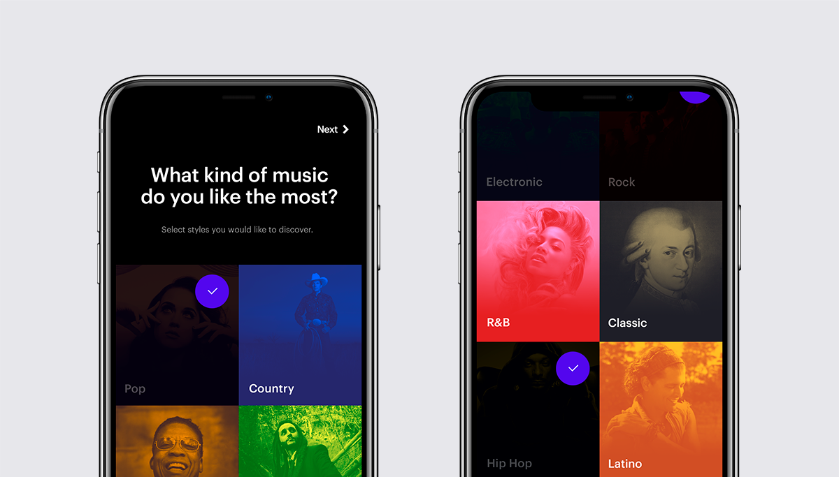
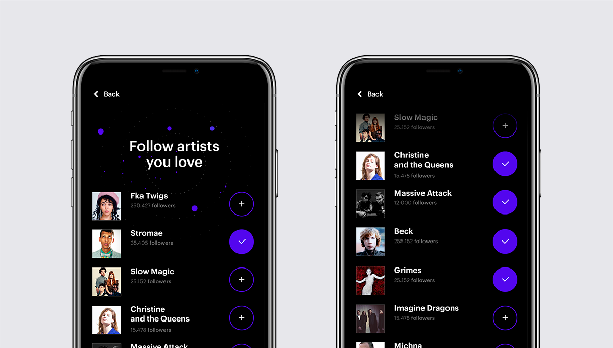
The onboarding process is of course a critical step as it’s going to greatly define if users are going to get excited of what’s to come, or if they’re going to simply hate Revelator for making it too complicated for them to use.
/03 Listing
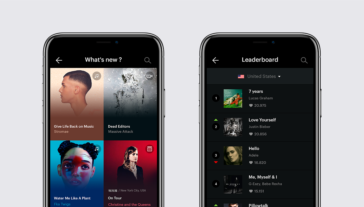
The global feed
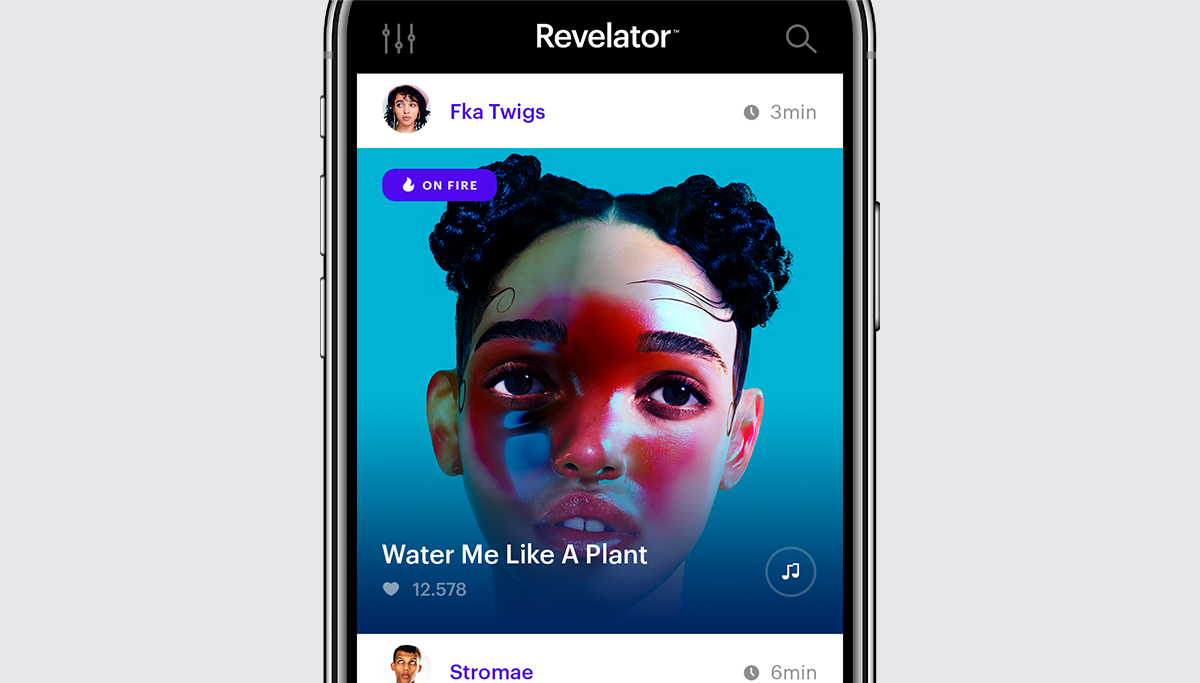
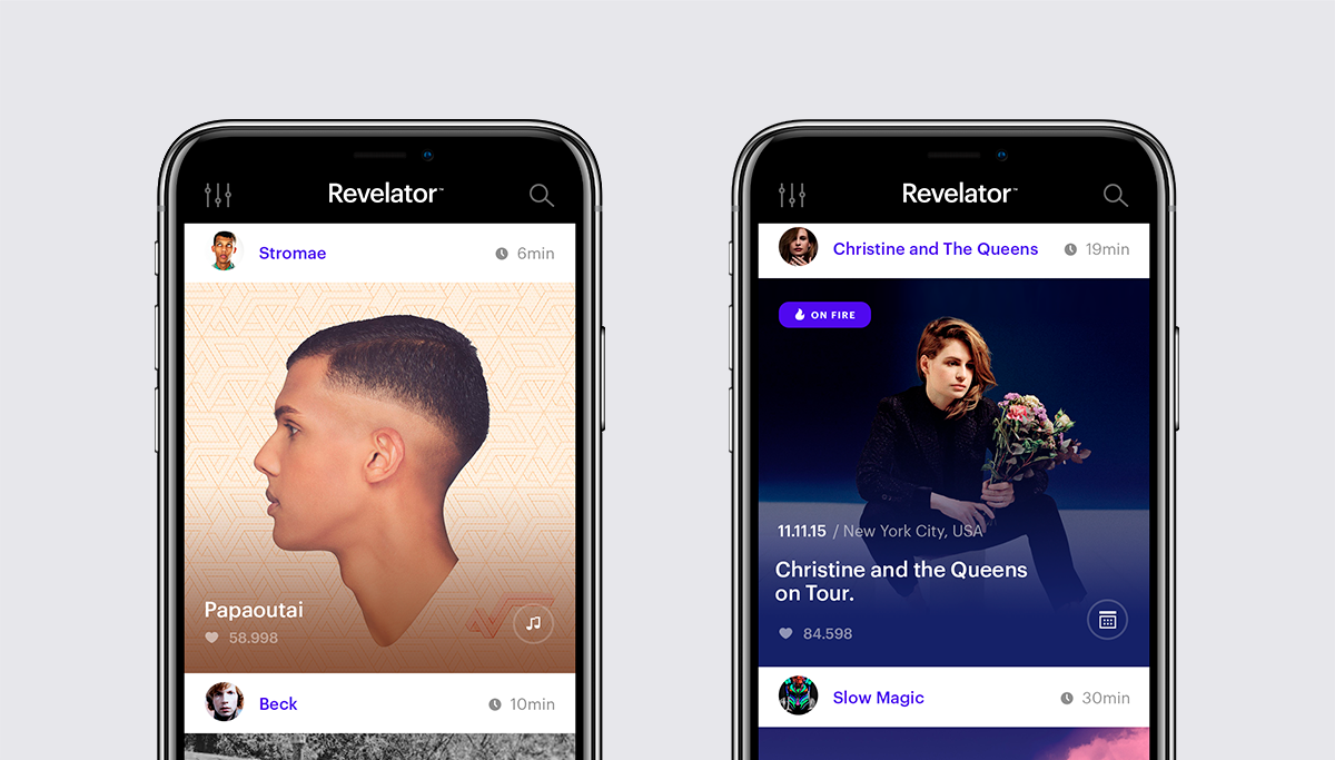
Once onboarded, you’re presented with a news feed directly digging from the best of the two worlds : big visuals, balanced with the option to listen to the music from the feed, or tap to get into the detail page of a music single.
/04 Promotion
So much content
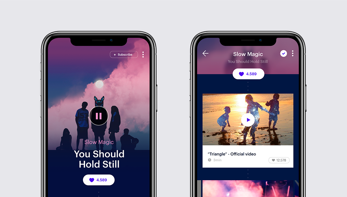
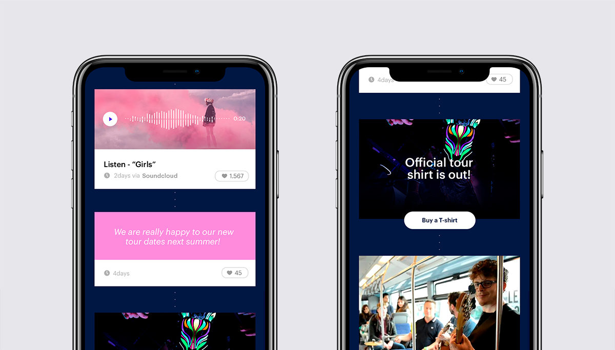
The main point of the application is to actually discover new bands, new singles, or exclusive content. We therefore designed detail pages, linked to a various content, and delivering a whole hierarchy of new elements.
/05 Player
Retro new player
The music player is always a tricky element as it’s nearly impossible to approach the subject without having the impression you’re now re-inventing the wheel, we somehow tried to bring our own touch to it with those minimalistic vinyl-like interaction. Shiny!

/06 Discover
Should I stay, or should I go
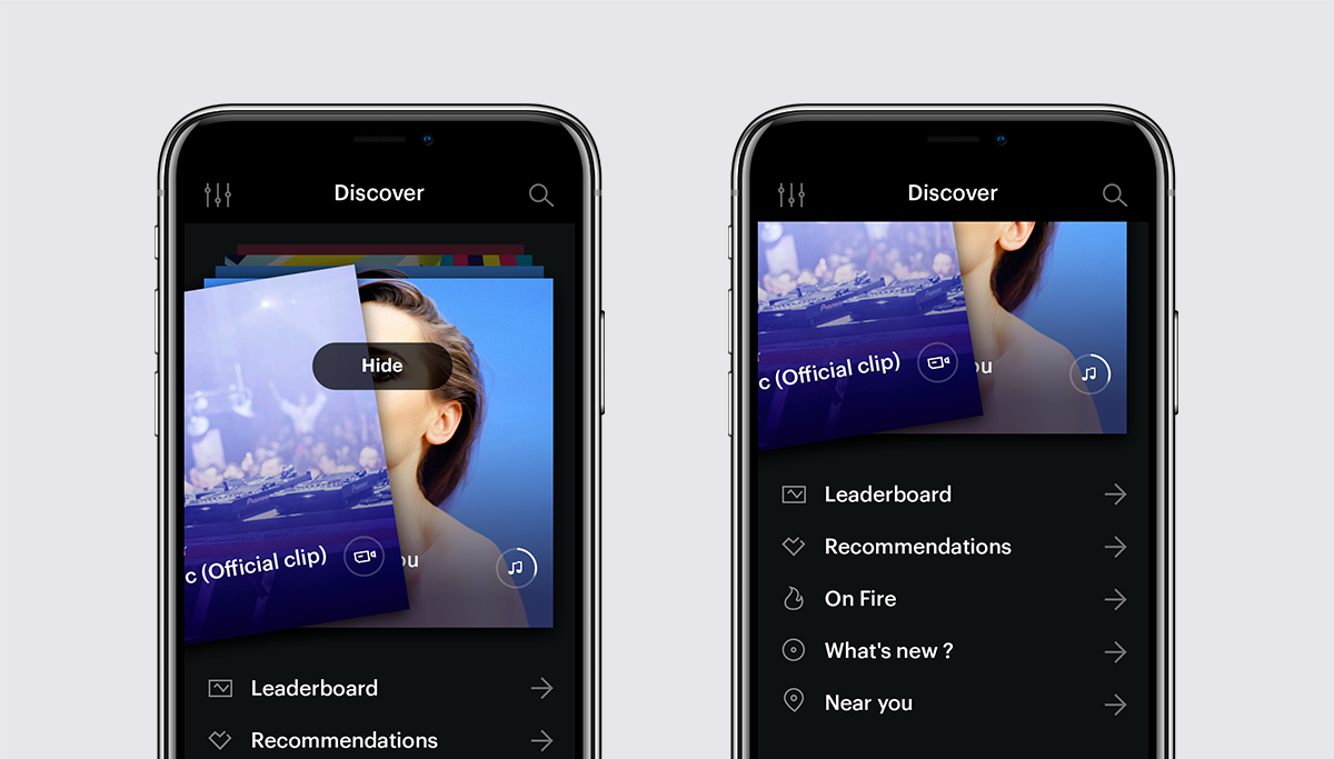
In the grand tradition of swiping applications, and as the rocket scientist we think we’re actually not, we decided to rely on this now well know mechanic to enable people to quickly parse the available content and contribute to the improvement of your selection by the app algorithm.


 English
 Español