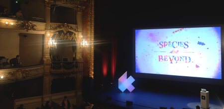
KIKK Festival 2018
Kikk Festival 2018
Another KIKK Festival yearly revamp: The “Species and Beyond” edition

/01 Context
- Design
- Branding
- Web
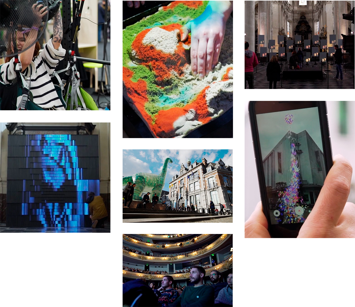
This case study is part of the series of yearly rebranding we made for the KIKK Festival from 2012 to these days. Each year, based on a theme chosen for the current year of the KIKK Festival, we work on a total rebrand of the festival, from concept and key visuals to the actual website, and on-site branding.
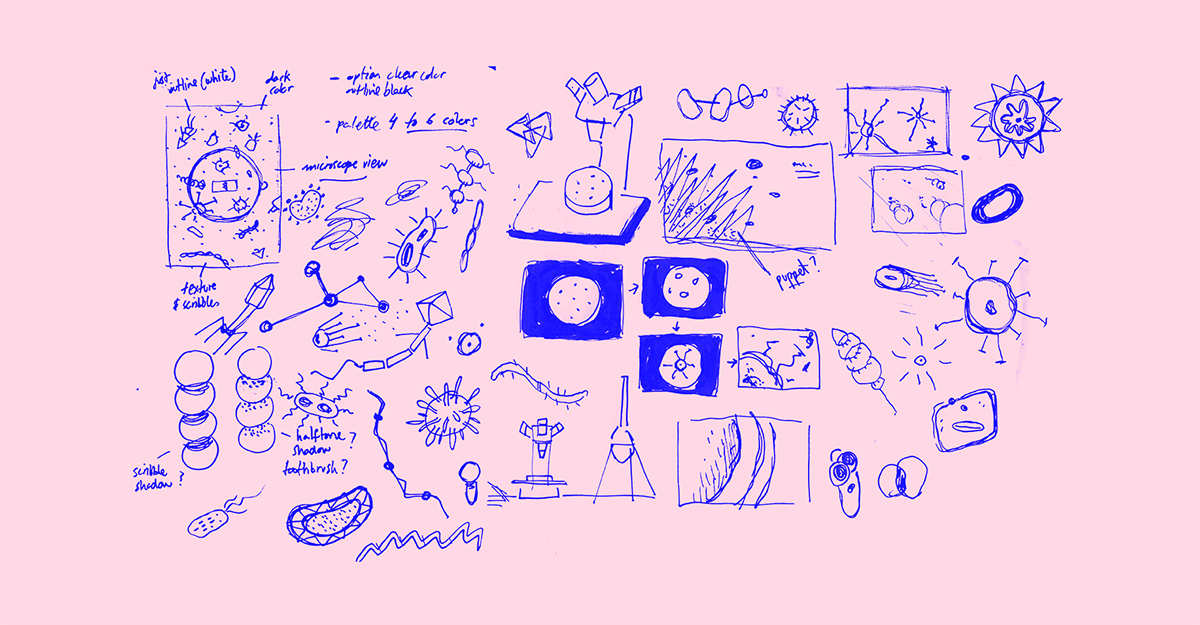
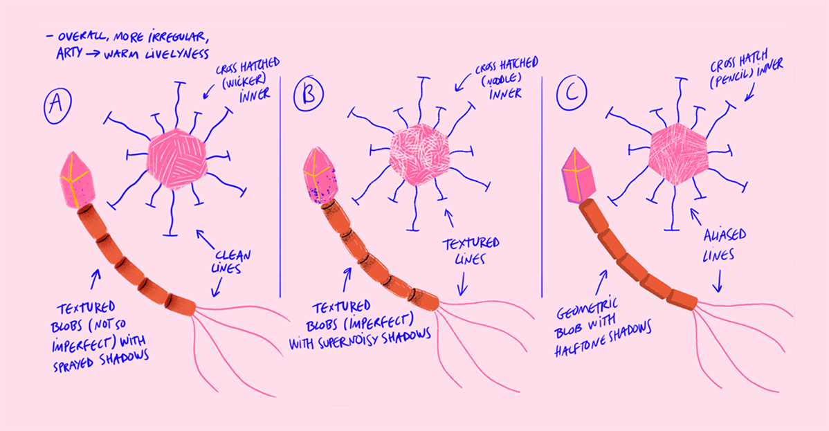
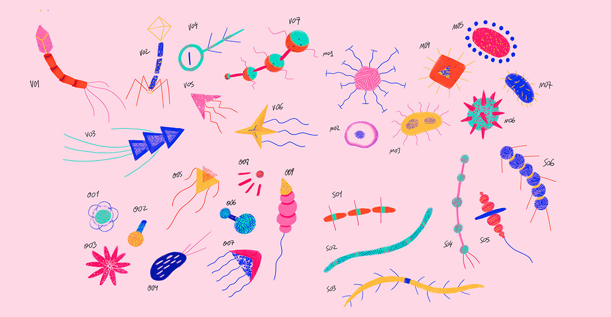
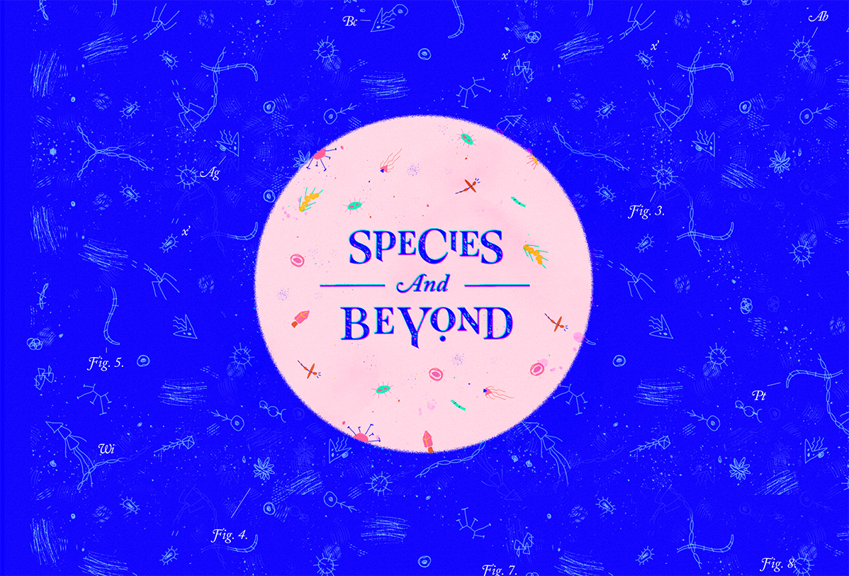
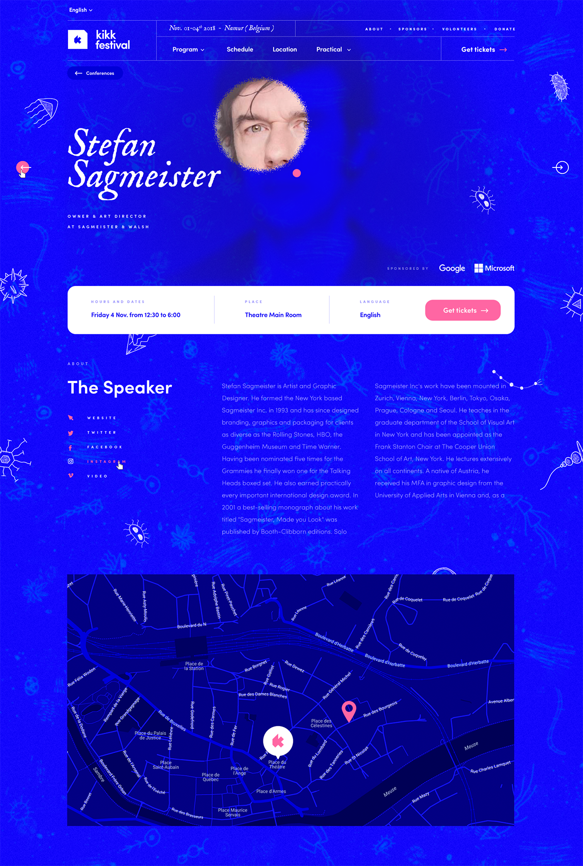
2018 aka the “microbian year”, and also known as the “let’s get out of our comfort zone” year. Why? It’s actually pretty simple : “Species and Beyond” was the perfect opportunity to approach the project under a simpler, more childish illustration style, and perfectly fitting our main concept: creating a set of organisms, living throughout the branding and website, and observable through the lens of a microscope.
/02 Identity
I’m blue, dabedi, dabeda
Globally, the first step towards building the yearly rebranding of the KIKK is establishing the right look and feel. Part of that work comes down to crafting a decent, usable, and appropriate logo, in a reasonable amount of time, as with the KIKK Festival redesign being mostly self-financed, we have to think fast and move quickly.
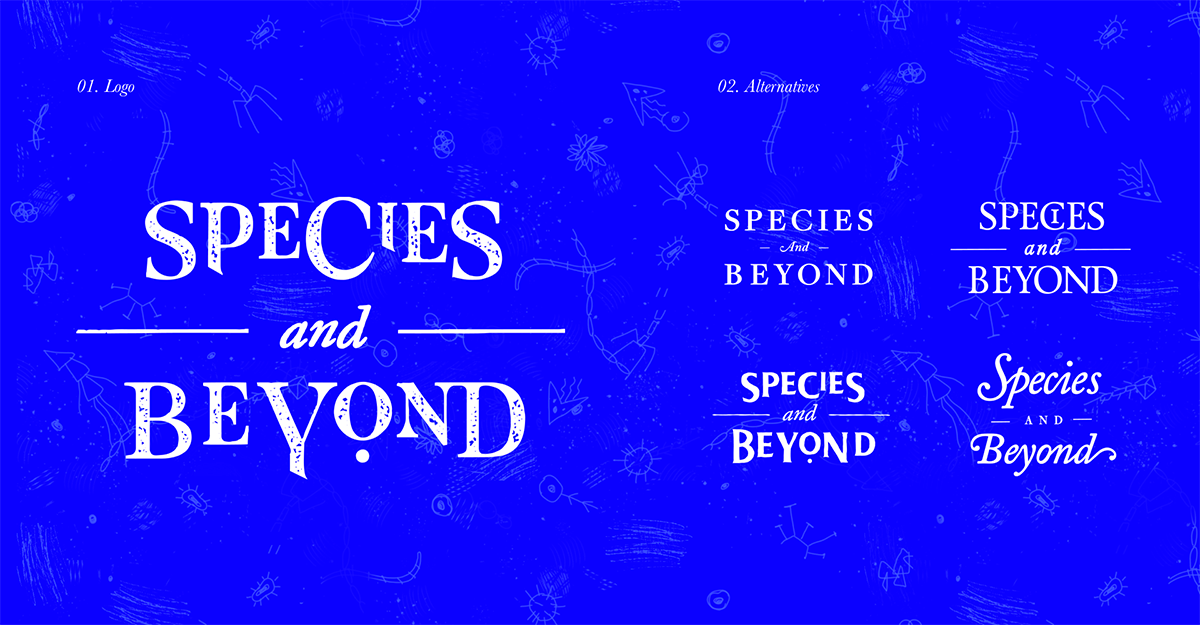
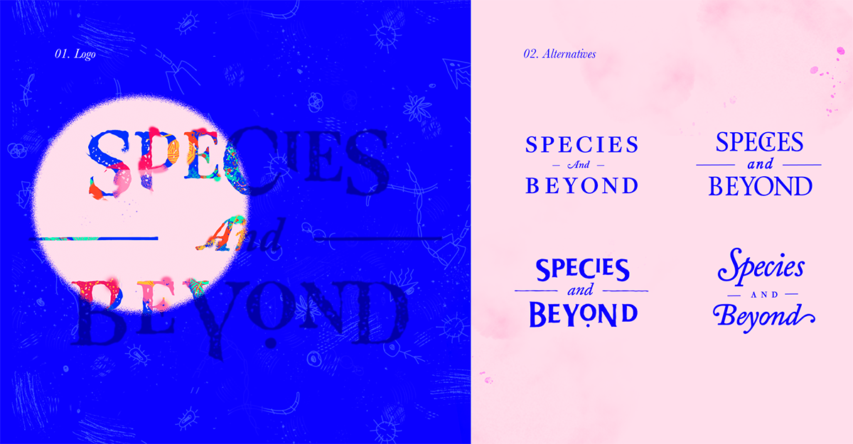
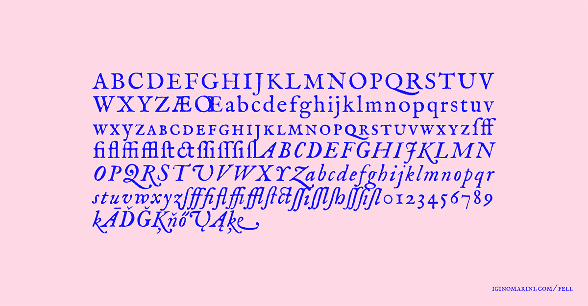
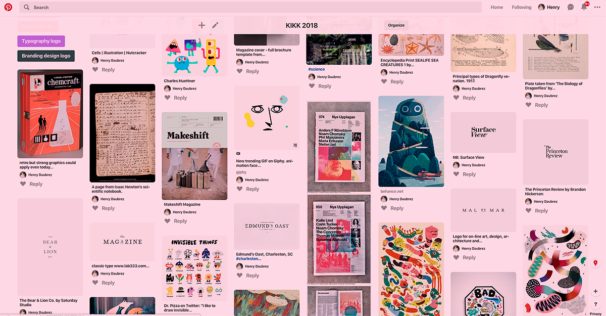
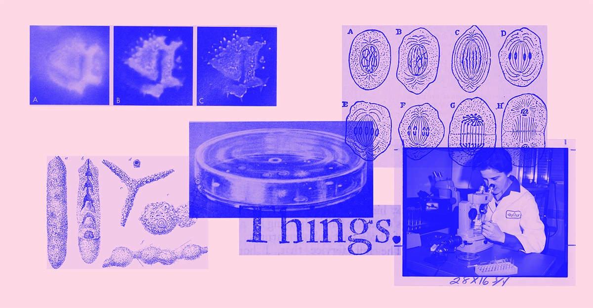
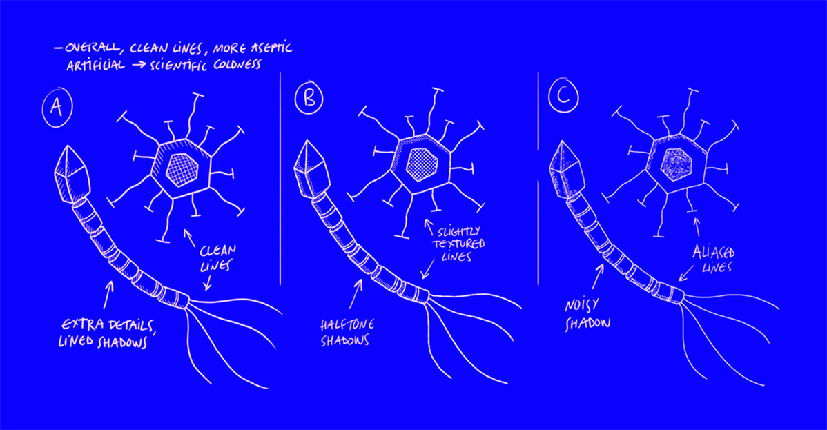
We felt that there was definitely something interesting to play with in opposing those hand drawn creatures with design codes directly inspired from the 19th century science books: small thin lines organizing space and pointing at things, grids, small captions, etc…The core idea was to create a funny tension between an almost childish style of illustration, with the rigor of those grids and organized spaces.
/03 Visuals
Call me maybe
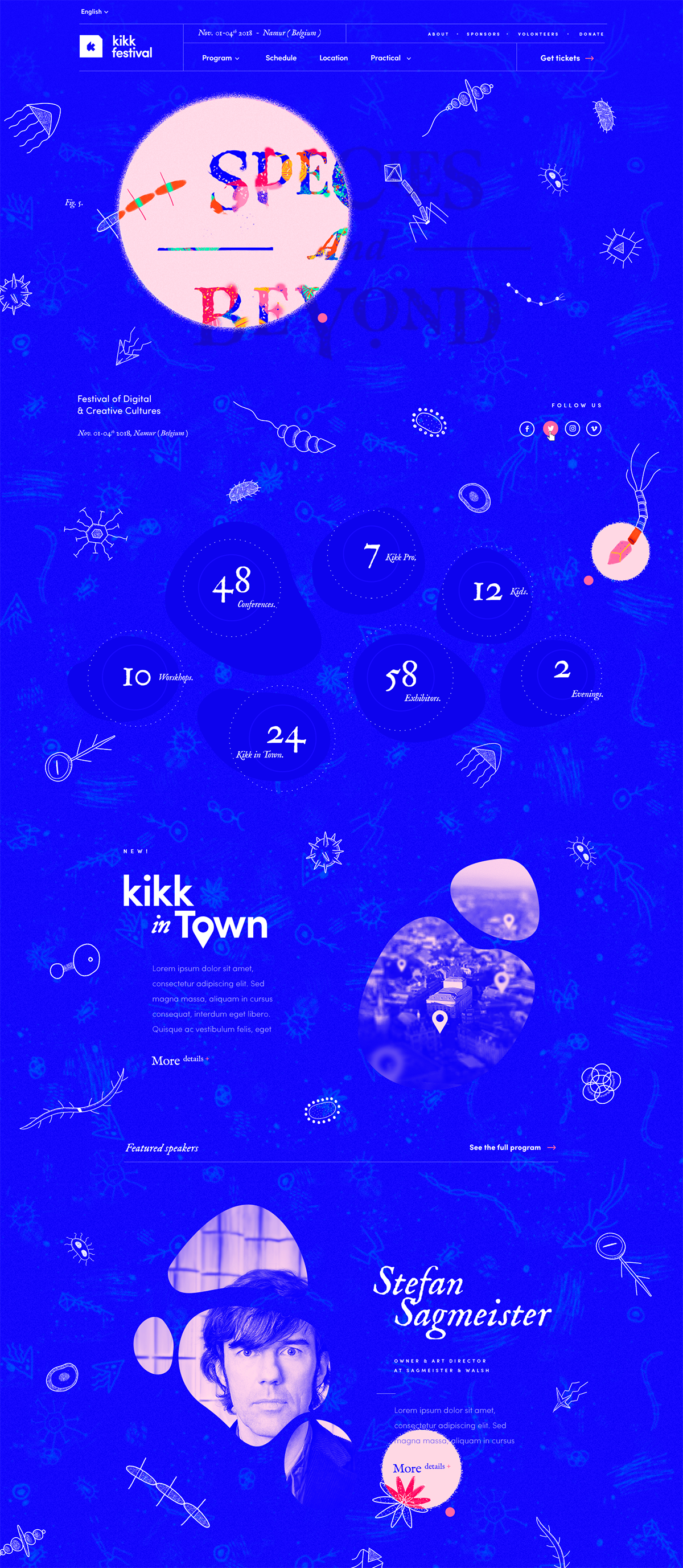
What’s fun about getting out of your comfort zone, is that fresh opportunity to call back your ol’ friends and get them to collaborate with you. This is how we got in touch with Christian Villacañas: friend, Spanish, moustached, and talented illustrator and animator. The brief was simple and the task a bit less so: we needed to create a family of simple and friendly microbial organisms, based on a restricted color palette, which would then be animated frame-by-frame and displayed on the website through fancy WebGL / canvas and stuff.
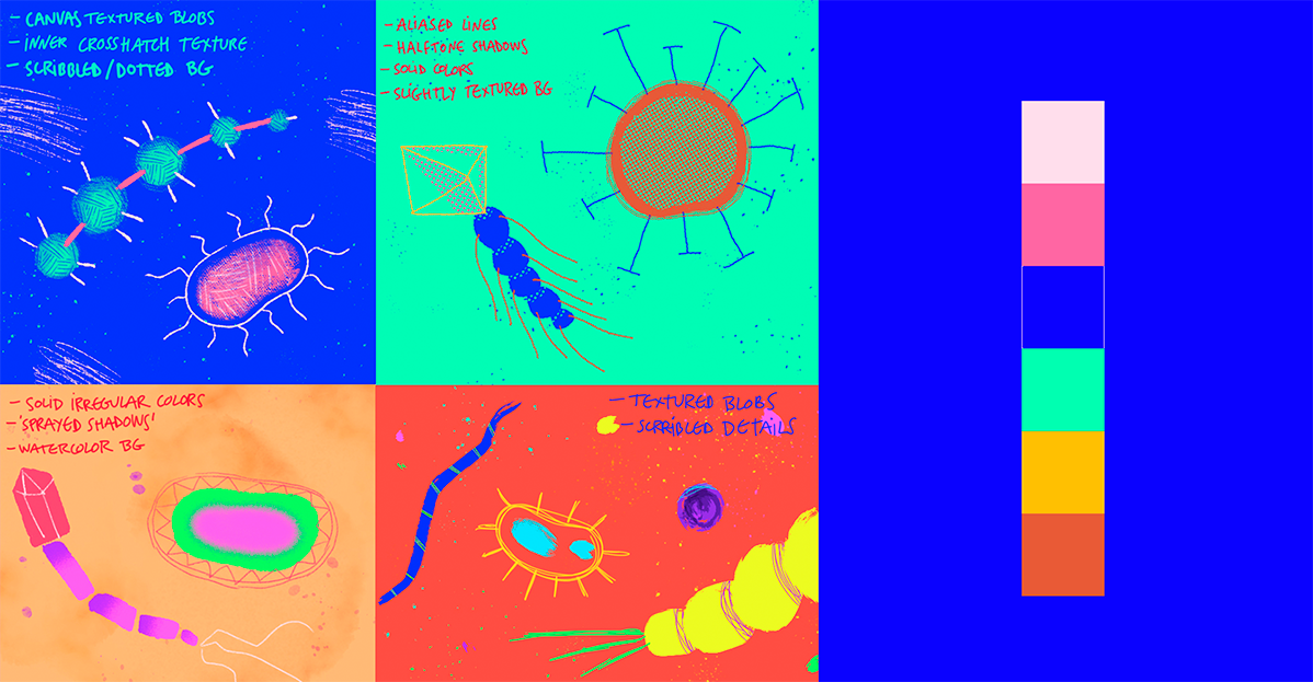
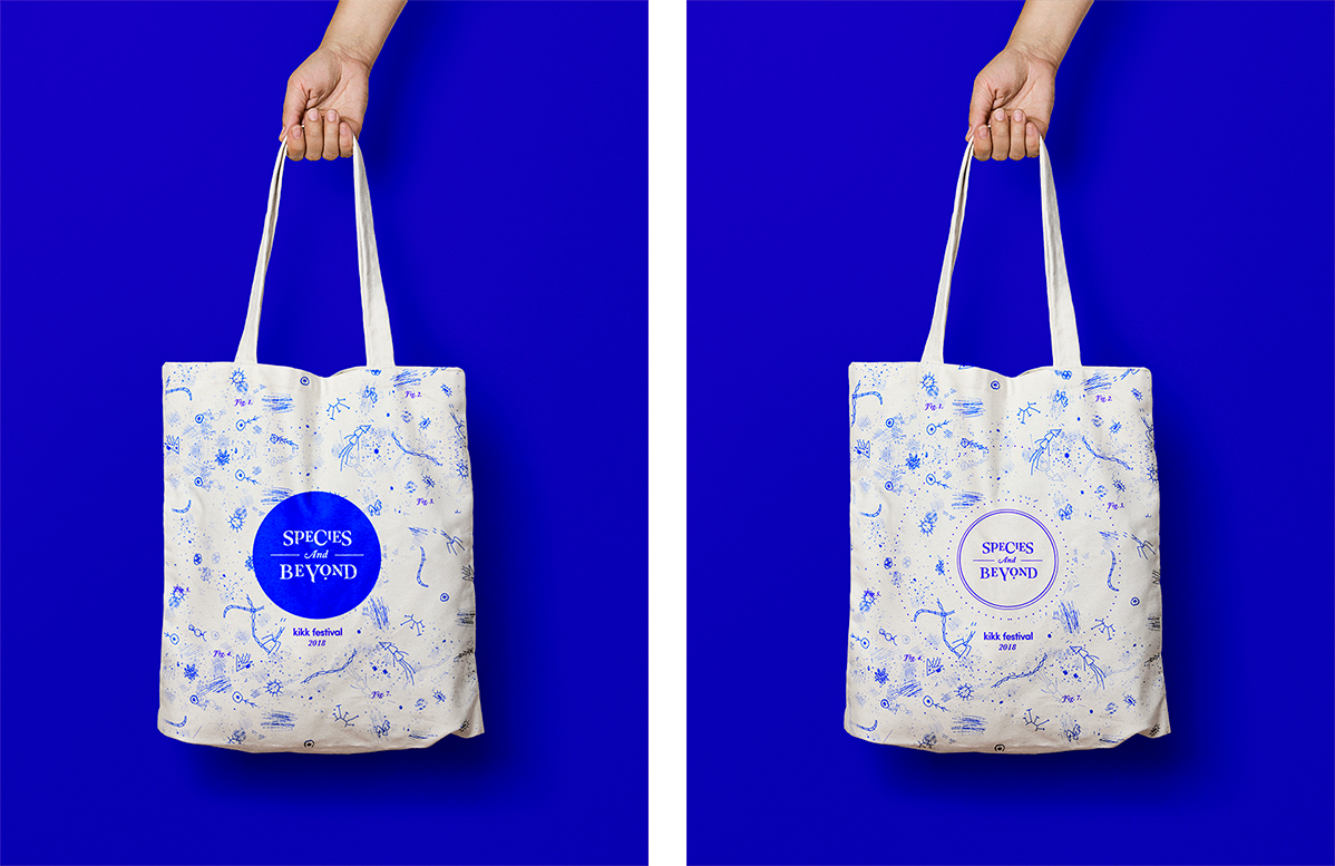
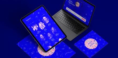
From that point, it’s all about building a consistent platform, between images, hover states, transitions, and all the little details making the experience both efficient and pleasurable.


 English
 Español