

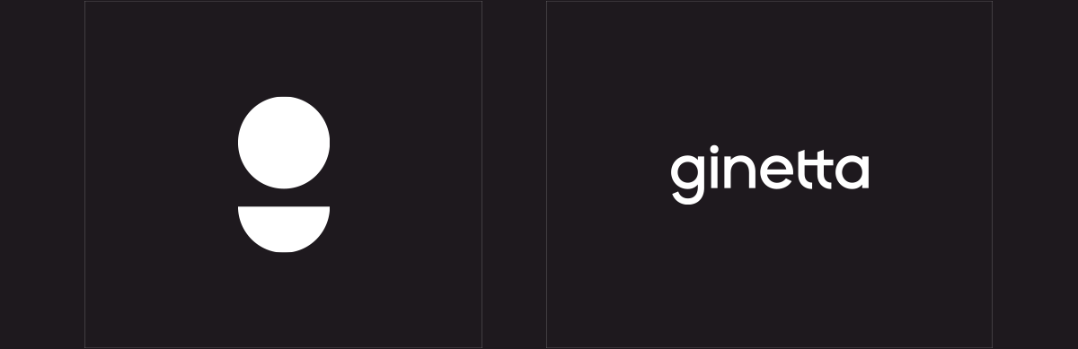
Ginetta
Ginetta
An authentic rebrand for one of
Switzerland’s leading product &
user experience companies.
/01 Context
- Strategy
- Design
- Branding
Allianz, Swisscom, Doodle, Hilti, all those companies are part of Ginetta’s strong pool of clients. 10 years in the making, they’re now leading the product design movement in Switzerland and needed a new branding to reflect their mantra : “We Simplify.”
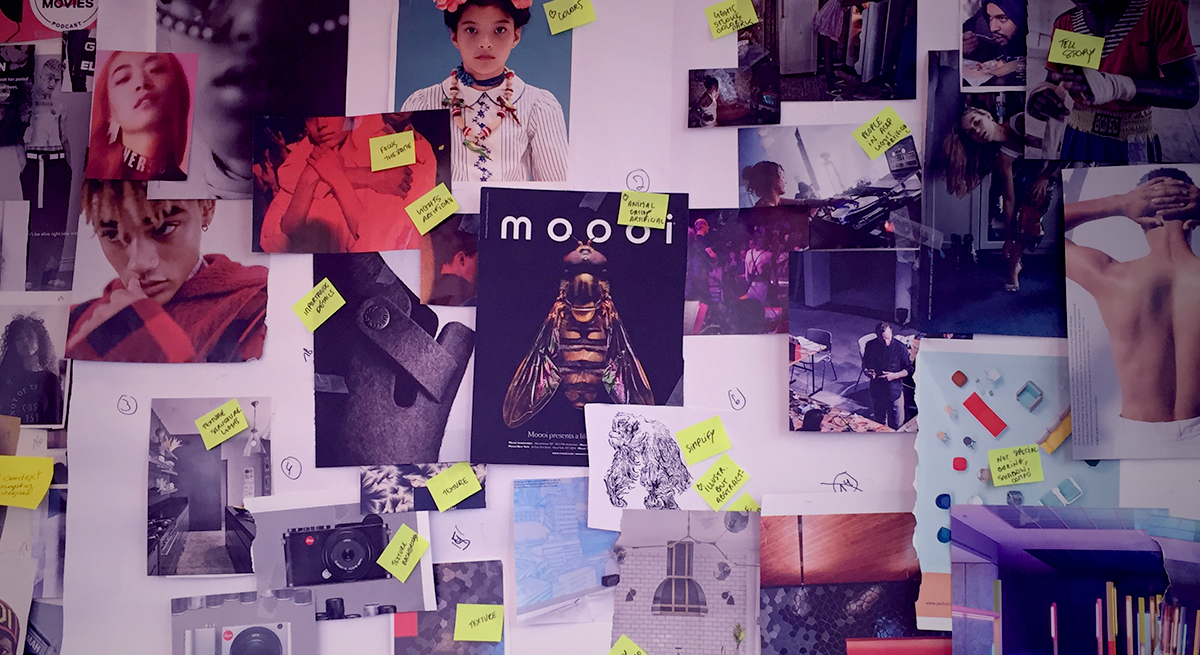
Sounded like an amazing challenge for us. We packed our bags. Gathered a pile of post-its, and got ready to meet them in their gorgeous office in the beautiful city of Zurich.This is the story of a branding which slowly unfolded its mysteries during a 6-months romance.
/02 The ideals
Simple doesn’t mean simplistic
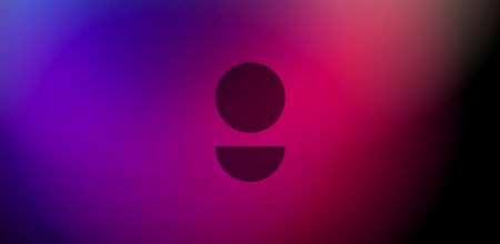
Ginetta defines the core of its work as extracting simplicity from the most complicated situations. Using that as a guide, we approached their rebrand with the exact same mindset. What better way to convey a sense of simplicity if not through an iterative process of peeling off layer after layer, and land on their new symbol. Between simple, user-centered, or just enigmatic.
/03 The ideals
Building a language
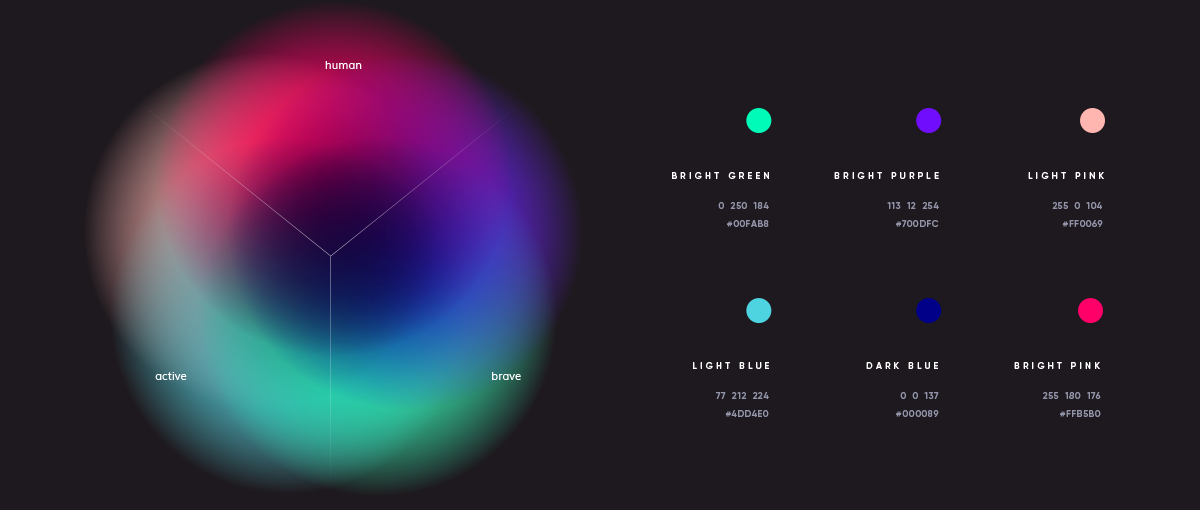
Creating a new brand isn’t only the logomark and pictogram (Duh, big reveal, thank you Captain Obvious!) We began by defining a global visual language. For color, we built a palette that reflects their core values. This allowed us to apply the right dose of their personality in the right places.

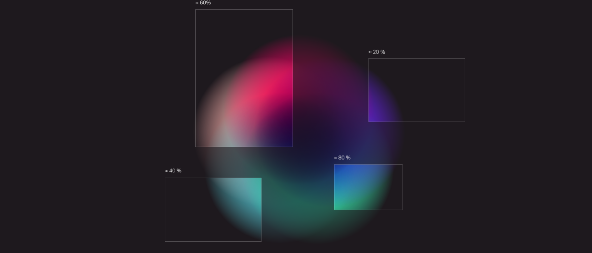
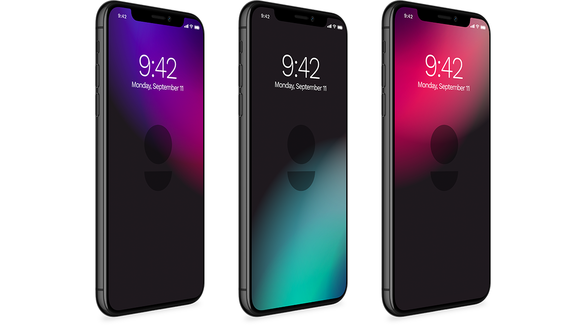
/04 Colors
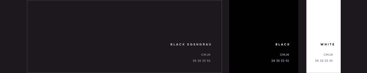
Black is the new black
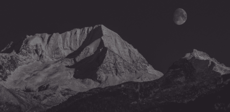
Most of the corporate branding is based on overlapping shades of black, but the contrast is created through variations of textures, fabrics and materials. We aimed at defining a subtle identity, displaying shapeshifting abilities and being able to either exist in large size, big and bold, or in other situations to just blend into its environment.
/05 Typography

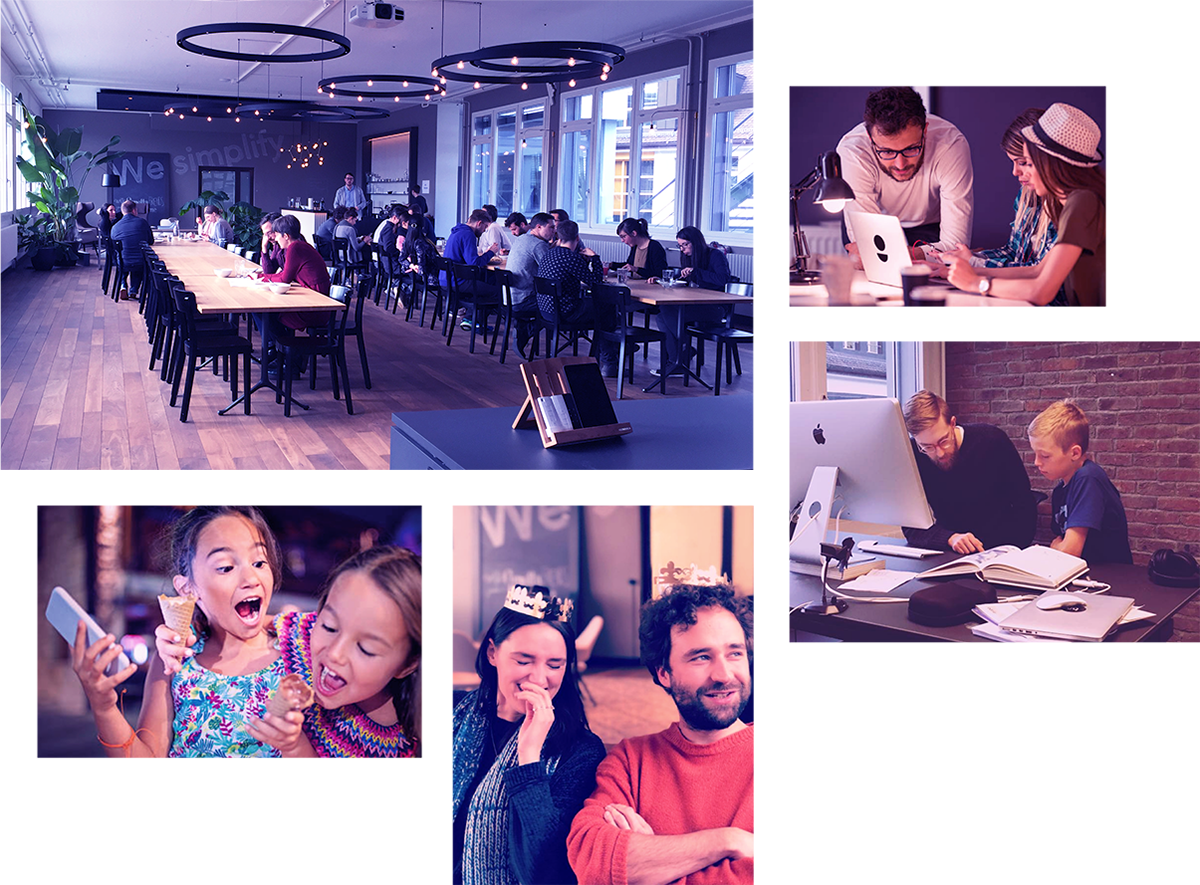
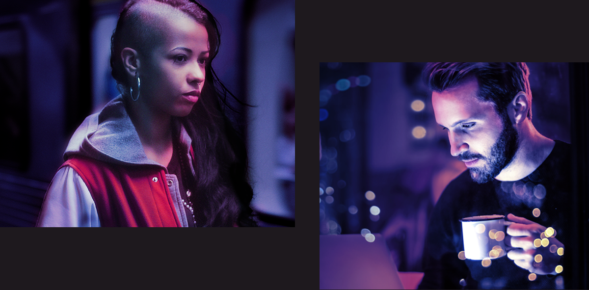
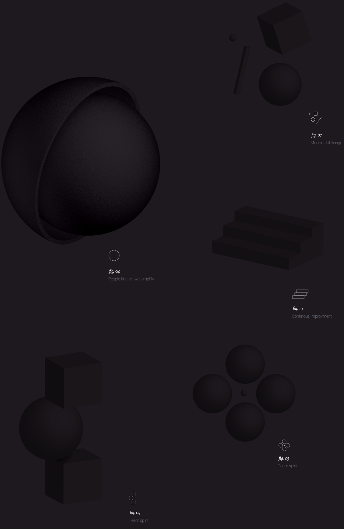
On the other hand, we defined their photographic imagery as a set of warmer images, rightly giving back the central place to human beings, while balancing that representativeness with a set of abstract 3D shapes we created.
/06 Shapes
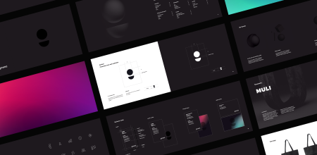
3D visuals and icons set
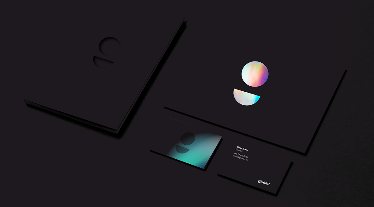
/07 Stationnery
Layout system and declinaison
L’Iris est utilisé sur une majorité des supports. Les différents axes de couleurs …
 English
 Español