KIKK Festival 2016
KIKK Festival 2016
Another KIKK Festival yearly revamp: the “Interference” edition.

/01 Context
- Design
- Branding
- Web
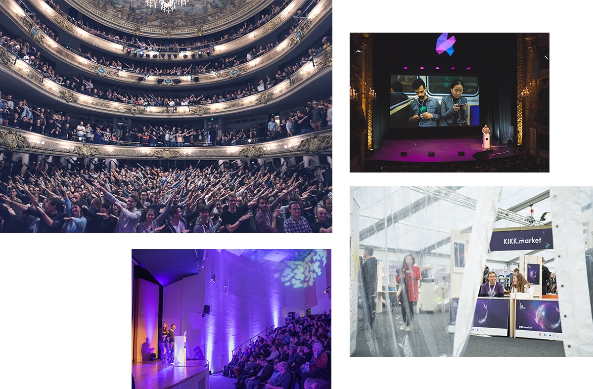
This case study is part of the series of yearly rebranding we made for the KIKK Festival from 2012 to these days. Each year, based on a theme chosen for the current year of the KIKK Festival, we work on a total rebrand of the festival, from concept and key visuals to the actual website, and on-site branding.
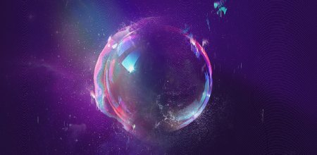
2016 was the year of “Interference”, meaning we could finally go wild with every single kind of interference we thought about, starting with the most poetic of them all : soap bubbles ( trivia moment, soap bubbles are indeed light interferences ) which quickly became the central point of that year’s concept, through a webgl version of it, but following with rainbows, glitches and so on.
/01 Concept
It all started with a bubble
You may not know it, but a soap bubble is nothing more than a light interference. Poetic, simple, pretty and even kids love them…could we really ask for more? We, therefore, decided to use a soap bubble as the very center of our art direction and as the central element of the key visual.
/01 Website
Own your story
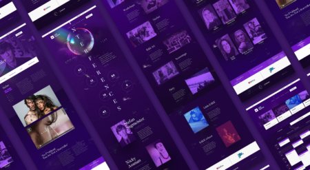
We knew our soap bubble was only the start of the story this website needed to tell its users. This is why we moved forward and imagined a series of real-life interferences and how we could visually represent them on the website. From rainbows to page glitches, from font modifications to an animated grain, we tried to make sure we were paying attention to all those details making a difference when you’re trying to engage your users. Yes, we’re that thorough!

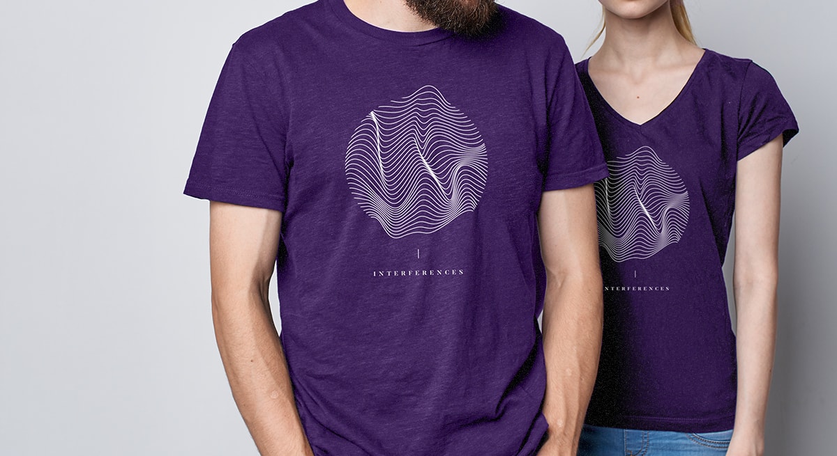
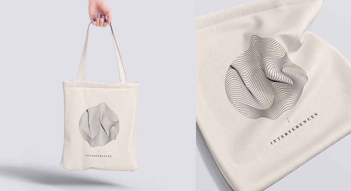
The website was of course only the start of our work, and we moved forward into creating every other needed output of the festival, including its yearly tote bag and t-shirt.


 English
 Español