Virgin Galactic
Virgin Galactic
Bringing users closer to space with a new immersive website for Virgin Galactic.

/01 Context
- Strategy
- Design
- Web
- 3D
On a mission to accelerate the future of transportation and define the next generation of space travel, Virgin Galactic launched its new commercial spaceflight website to connect all those who are curious about space travel. The brand partnered with us to redesign their website which reflects the company’s vision & desire to create a community for future astronauts.
Virgin Galactic, the pioneering space tourism company founded by Sir Richard Branson, aims to make commercial spaceflight accessible to the general public. Together we transformed their website into an immersive, future-proof, and scalable platform that offers an unparalleled experience to users. With this project we implemented loads of new features, hypersegmented relevant content, and cutting-edge technologies that bring users closer to the brand.
/02 The experience
The Challenge
Getting this project off the ground – pun intended – required us to dive deep into the technology and know-how behind space travel. Virgin Galactic’s team of experts was our go-to for all our questions about visuals and content. They schooled us on all the nitty-gritty details, from intriguing technical terms to the true astronaut experience.
Armed with this knowledge, we built something even more mind-blowing than we initially planned. We were lucky to have Virgin Galactic by our side, guiding us every step of the way and pushing us to blend technical precision with breathtaking aesthetics – because, hey, it is rocket science!
Creative Concept
Our main goal was to transport users to space without leaving their couch. Picture this: immersive 3D sections that make you feel like you’re in the middle of an epic sci-fi movie, with jaw-dropping lighting effects and camera moves. But that’s not all – this website is packed with an abundance of fascinating content. We had to find a way to seamlessly combine these two elements into one cohesive experience.
So, here’s what we did: We added some smooth transitions between the heavy-hitting immersive sections and the content-packed parts. We wanted to make you feel like you’re floating in zero gravity, so we animated elements like text and images to give them that weightless feel. And to add to that, our color palette captures the atmosphere of space with cool blues, purples, and blacks. It’s like having a mini space adventure right on your screen!
Future so bright, you’ve gotta wear shades
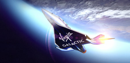
Now, let’s talk about the grandeur of Virgin Galactic’s work. We couldn’t just hide it away in some tiny corner of the website. Oh no! We wanted to show off their amazing processes and technology in full 3D glory. Imagine scrolling through an awe-inspiring journey of a spaceship’s return to Earth or getting a front-row view of their legendary spaceport.
We worked closely with the Virgin Galactic team to ensure every technical detail was spot-on. Internally, we were on a mission to deliver maximum emotion and grandeur, drawing inspiration from movies with lens flares, epic camera movements, and other visually delicious tricks. JJ Abrams, eat your heart out!
Learn as you go
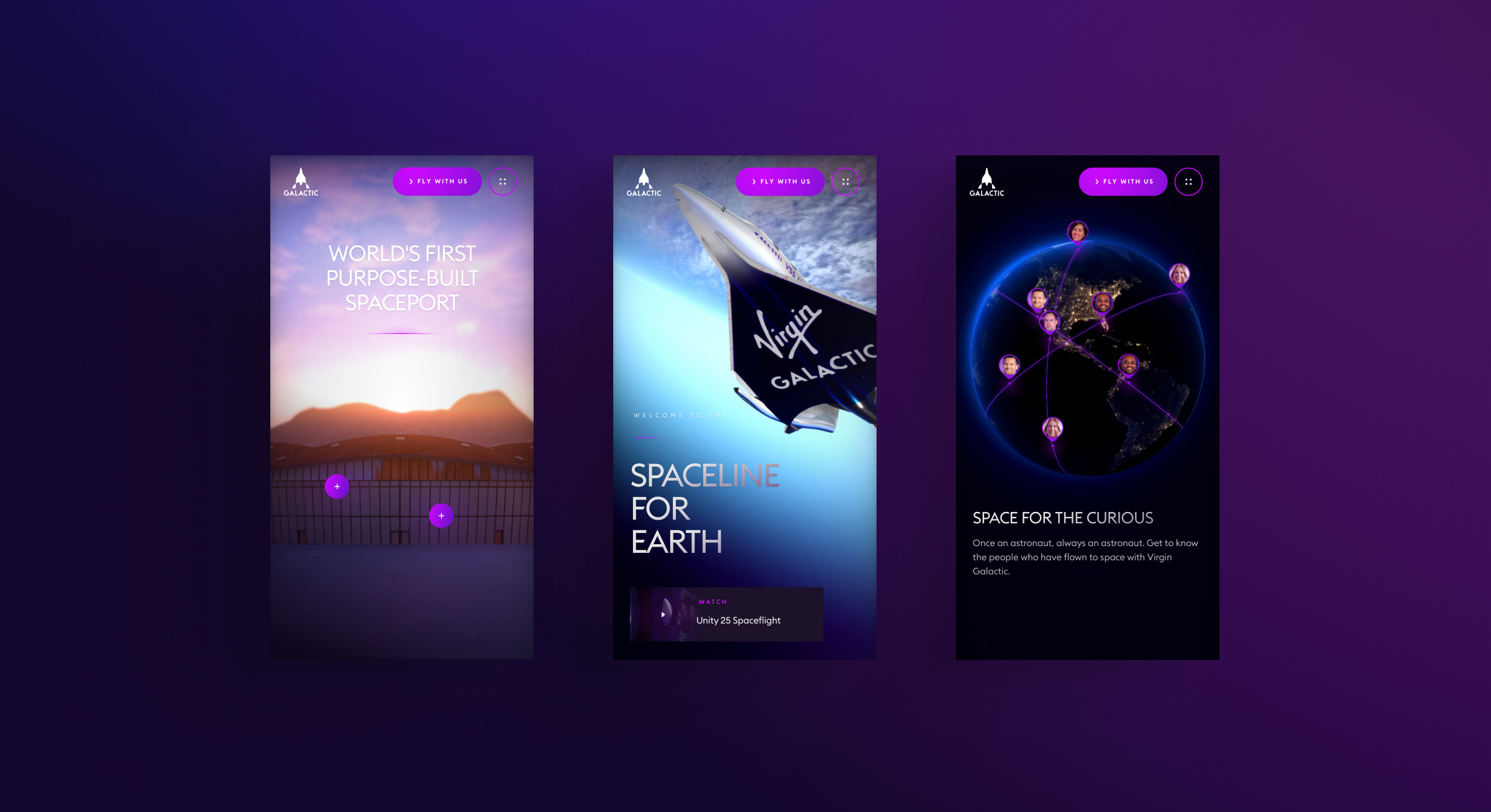
It’s not all about impressive visuals. We had tons of awesome content to play with, too. So, we came up with the idea of using media cards. These bad boys could hold all sorts of info, whether it was audio clips, videos, or text. We sprinkled these cards throughout the website, giving you extra context and immersing you in the experience without being a buzzkill.
And to give the 3D surroundings space to shine – yes, another pun – we used hotspots. These little gems let you explore the extraordinary 3D environments while giving you the chance to learn more about what you’re seeing. It’s like magic.
/03 Under the hood
Conquering WebGL 'Subscenes'
We took on the challenge of working with multiple WebGL ‘subscenes’ for the first time. It was a rollercoaster ride of excitement and nerves, but we were determined to deliver a seamless experience. Planning transitions became our top priority. Whether it was shifting between Eve and Unity spacecraft sections or the stunning space-to-ground journey on the Spaceport page, we focused on minimizing loading and performance impacts. The result? Smooth transitions that keep you absorbed in the moment.
Enhancements for the Future
Our in-house WebGL framework, AstroGL, got a major upgrade! We’ve been laser-focused on making it better by improving how we handle the render loop and set up scenes. These improvements are setting the stage for future projects and have allowed us to collaborate closely with our talented 3D team.
Together we conjured up a versatile lens flare system that adds a cinematic element to our scenes. But we didn’t stop there. We dedicated time to optimizing our assets and experimenting with new techniques. And it paid off big time. Now everything loads faster and looks stunning. It’s a win-win!
But wait, there’s more! We’ve also taken interactivity to a whole new level. We developed a complex event system that amps up communication between the front-end and WebGL. And of course, we wanted our WebGL scenes to be flawless. So we put in extra effort to fine-tune our GUI panels and nail down the export/import architecture. It’s all about those little details that make a big difference, and we’re absolutely pumped about it!
A Breathtaking Experience
How did we fit the cosmos into your web browser? It certainly wasn’t without its challenges.
Using realtime reflections on the 3D spacecraft would run the risk of degrading the experience on lower-power devices, so we had to come up with another way to make the ships as beautifully shiny as they are in-person. So we used multiple 360-degree renders of the surrounding WebGL scene as environment maps for lighting and reflections, transitioning between those maps and the camera position as an input. This gives the illusion of natural, realtime reflections, but at a fraction of the performance cost.
Our two-way pinning/clipping swipe transition made navigation smoother. A suite of animations triggered by scroll position and swipes keep visitors immersed regardless of whether they were taking in 3D scenes or seamlessly integrated dynamic content from the CMS. This is just one of the many details that helps take you on a captivating journey without leaving your screen.


 English
 Español