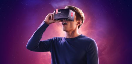
Quick Space Drive In
Quick
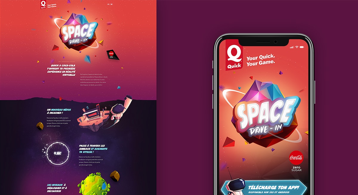
Building an exciting and immersive VR gaming experience for the masses

/01 Context
- Strategy
- Design
- Branding
- Web
- VR/AR
When Quick, part of Burger King, and Coca-Cola knock at your door to challenge you with the mission of bringing the right dose of technology and innovation to the homes of hundreds of thousands of Belgian people, you keep calm, eat burgers and drink soda ( but diet though ).
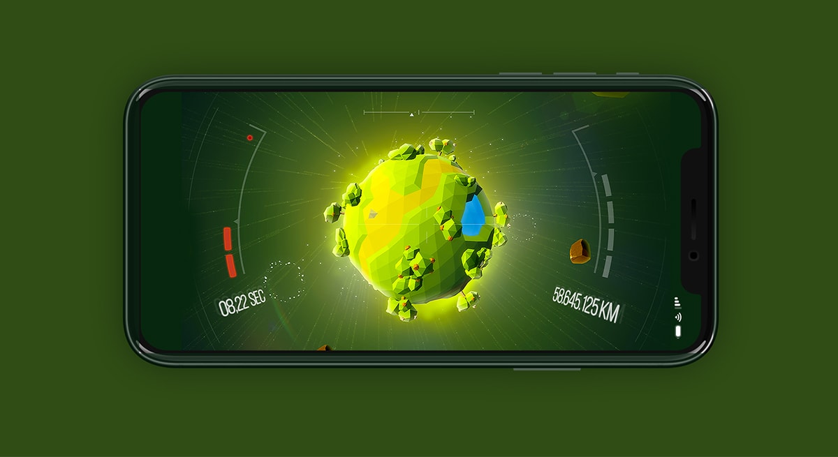
With Virtual Reality still being pretty much of a buzzword for most people living in Belgium, we decided to turn tables and build a VR game people would play directly from their smartphones on a cardboard headset they could buy for one euro at their local burger dealer. The principle of the game is pretty simple : you have a limited time to get through the maximum number of rings floating in space while revolving around planets directly inspired from actual Belgian cities. You’re supposed to quickly arrive at the drive-in, but of course, to make it complicated, you’ll be solely directing your spaceship with your phone’s gyroscope. Wait, gyrowhat? You know, The- thing-which-tells-your-phone-you-are-moving-and-moves-the-screen-accordingly. So…result? Result, you’re in for a little dance with your cardboard headset.
/02 The ideals
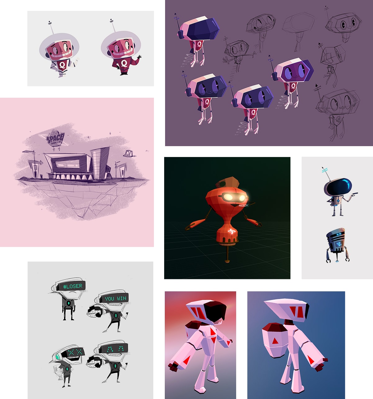
The making of a universe
Space Drive-in, quickly came as the right name for the whole project, inspiring us to create a game which would be colorful and enjoyable for the whole family, while retaining at least a part of a retro vibe to it. Our challenge was to tap into people’s excitement and emotions, while coming up with a style which would be appealing to the whole family.
/03 Cardboard
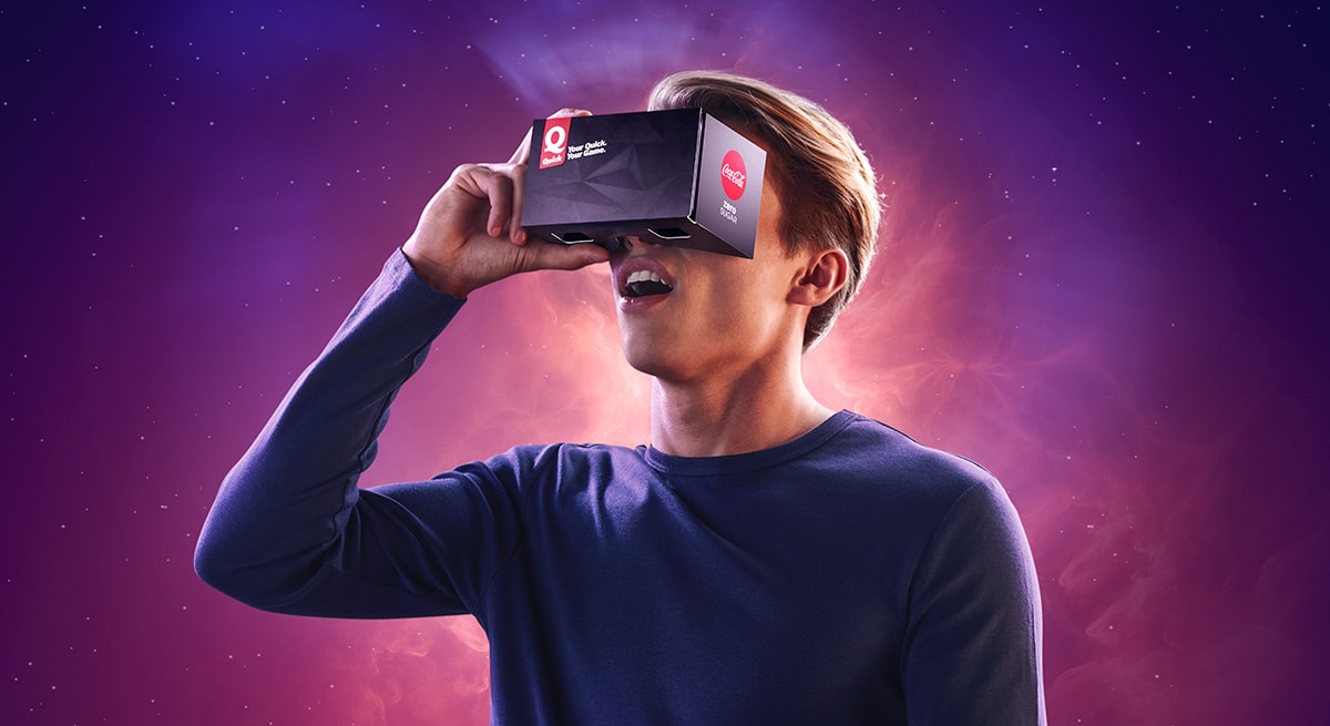
Cheap luxury
The design of the headset in itself came as a major challenge. We knew we wanted the object to feel anything but cheap to the people buying it, just because it could be bought for a single Euro, we did not want it to feel disposable. We turned to a sleek black polygonal look and feel for the outside, reminding users of the low-poly aesthetic of the game, while going for a dark brushed-metal texture in the inside, making it feel strong and sturdy.
/03 Low poly
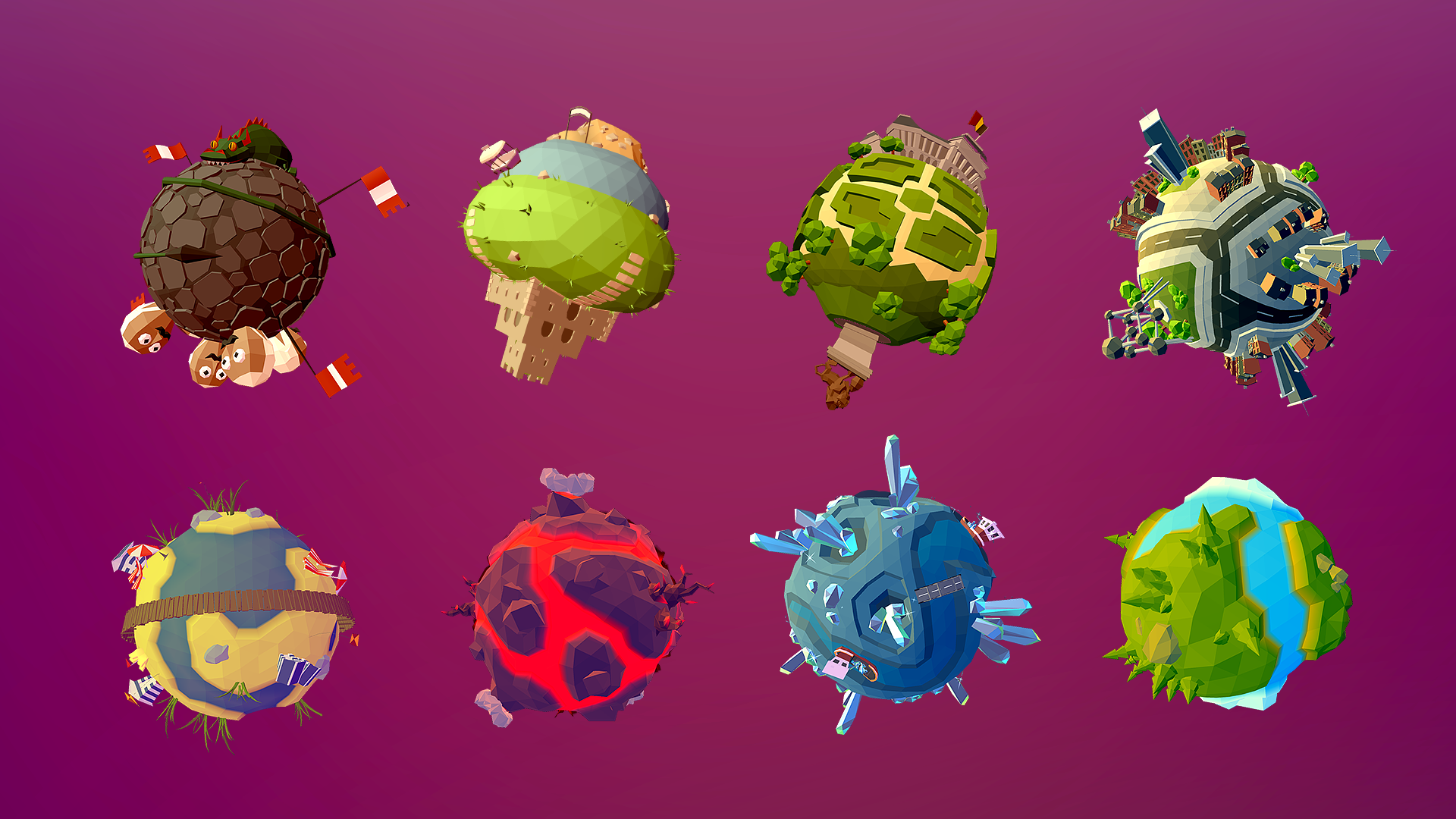
The Belgian planet system
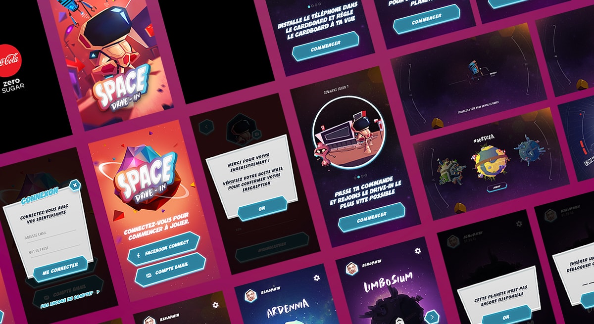
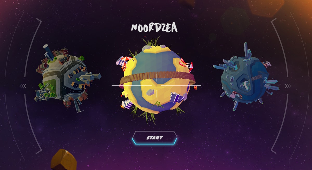
Directly inspired by actual cities from Belgium, all low-poly planets were designed to be an appropriate display of the landmarks from their real-life counterparts. From the smallest to the biggest cities of the country, each then became the different levels of the game. On top of those, we imagined and built an usable Unity-powered app to run the game, and a website to promote it.


 English
 Español