De Bijenkorf
Bijenkorf
An interactive fairy tale
for Amsterdam’s biggest fashion department store.

/01 How it started
- Design
- Concept
- Development
- Illustration
The Amsterdam-based agency DEPT contacted us on behalf of their partners Bijenkorf with the festive ask - “Please craft us an innovative Christmas story”. So as we waved our last goodbyes to August’s comforting warmth and welcomed this challenge as a way to take the bite out of winter’s impending arrival. Winter was coming.
Sharpening our Apple pencils, and filling our heads with magical imagery, we quickly aligned with DEPT’s team to sketch the outline of the Bijenkorf’s online Christmas campaign. Creating an enchanting moment for online shoppers started with the Bijenkorf name itself: “beehive” in English. Additional magic came from expanding our hive to collaborate with the amazing French-Canadian illustrator Myriam Wares.
/02 Discovery
A peek at the craftmanship
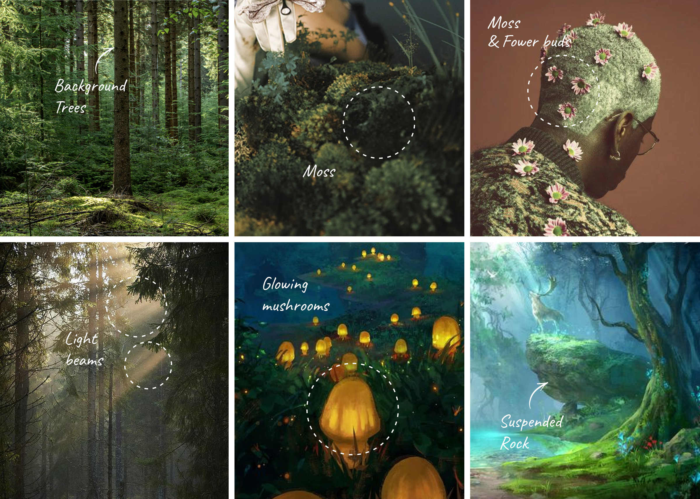
This year Bijenkorf wanted to stand out. To step away from the very expected snowy clichés. The OOH campaign’s main inspiration was an Indian summer in a northern pine forest. Online, we wanted to explore this mystical woodland further. Gathering visual references that would better guide the overall art direction, Myriam Wares’s unique hand drawn style worked like a charm. The colour palette purposely spans from vibrant plain green and frost blue to yellow tones, creating a strong contrast and strengthening the focus area.
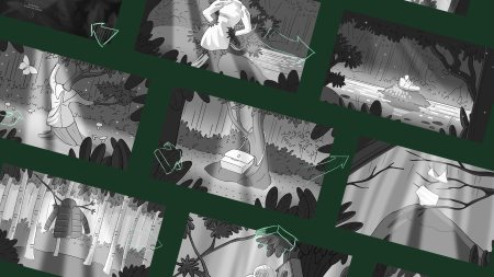
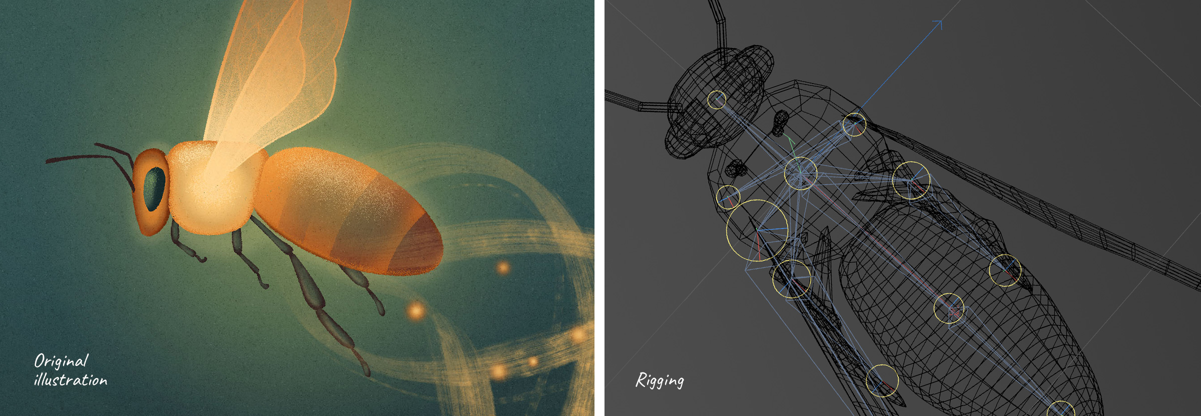
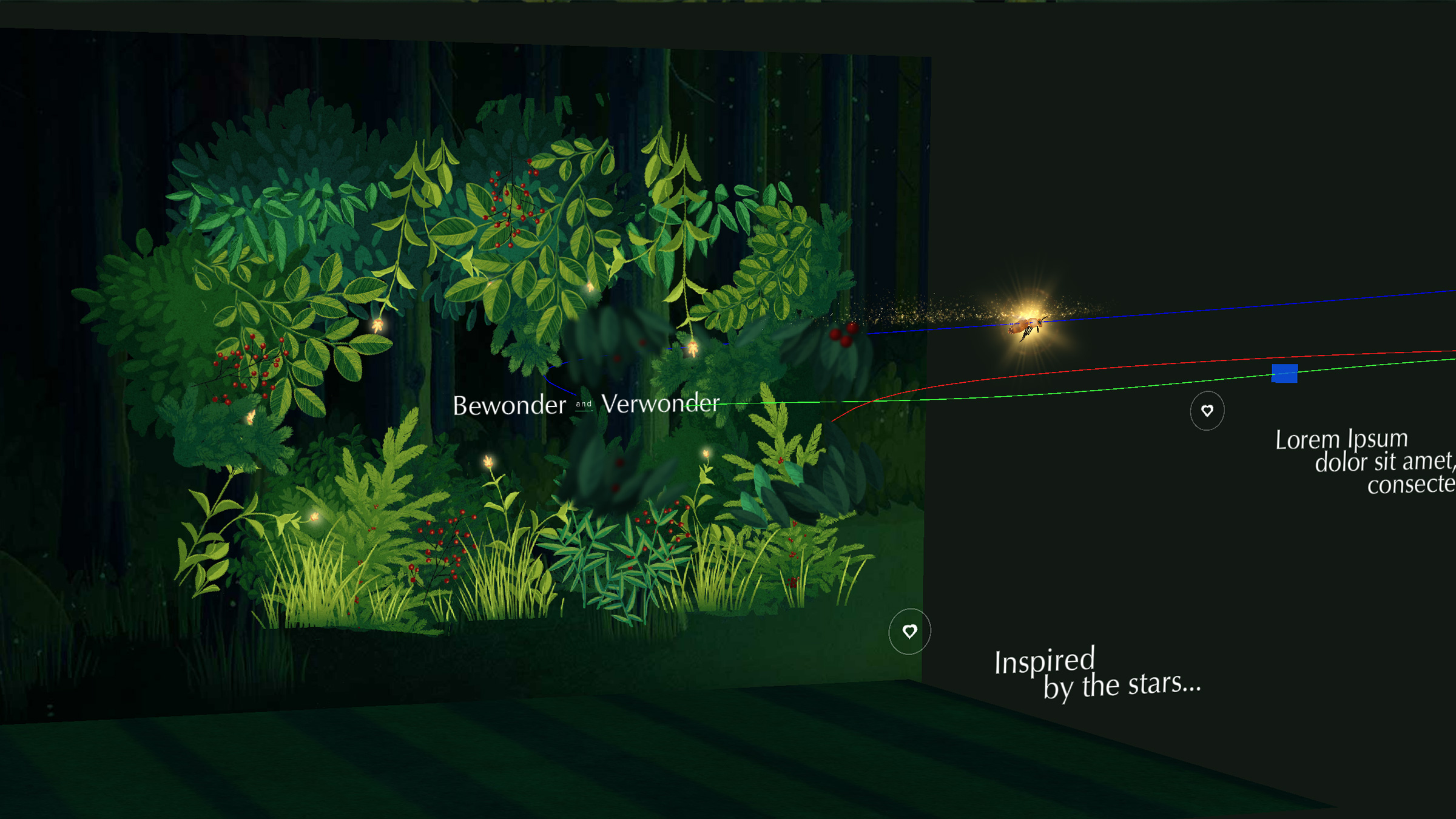
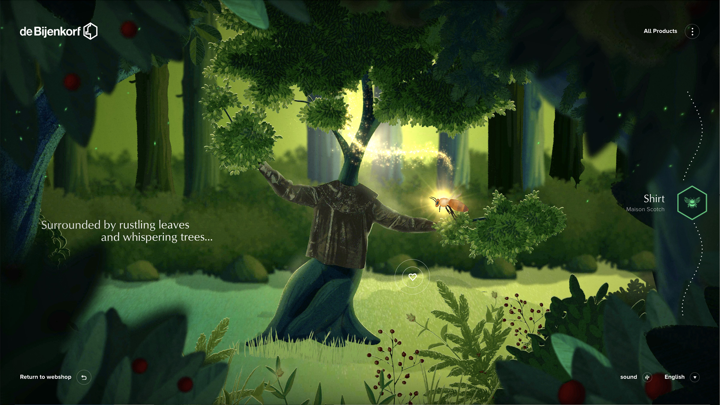
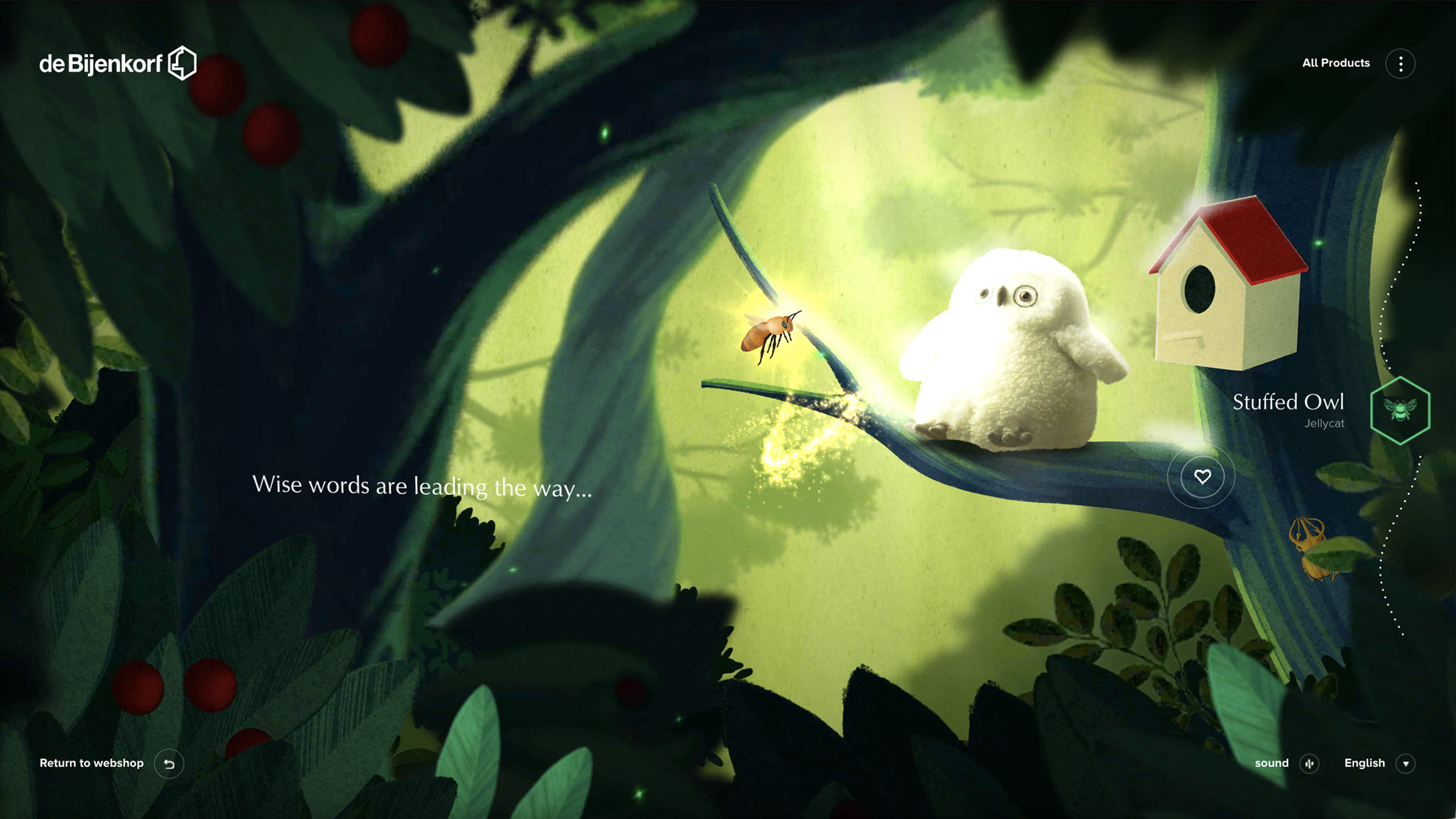
The Bee is our guide through this magical experience, a wisp of sorts in our winter wonderland, so we wanted to give her all the attention she deserved. After experimenting with a couple of outfits to ensure she could endure the cold from winter, we settled on one illustration that was immediately handed to the Dev team to bring her to life. 2D sprite animation was quickly shelved as too restrictive for her to freely fly across the website. So we decided to model it in 3D and wrap Myriam’s drawings around it. For the wonderland itself, we assembled all scene illustrations and transported them to our WebGL compositing scene.
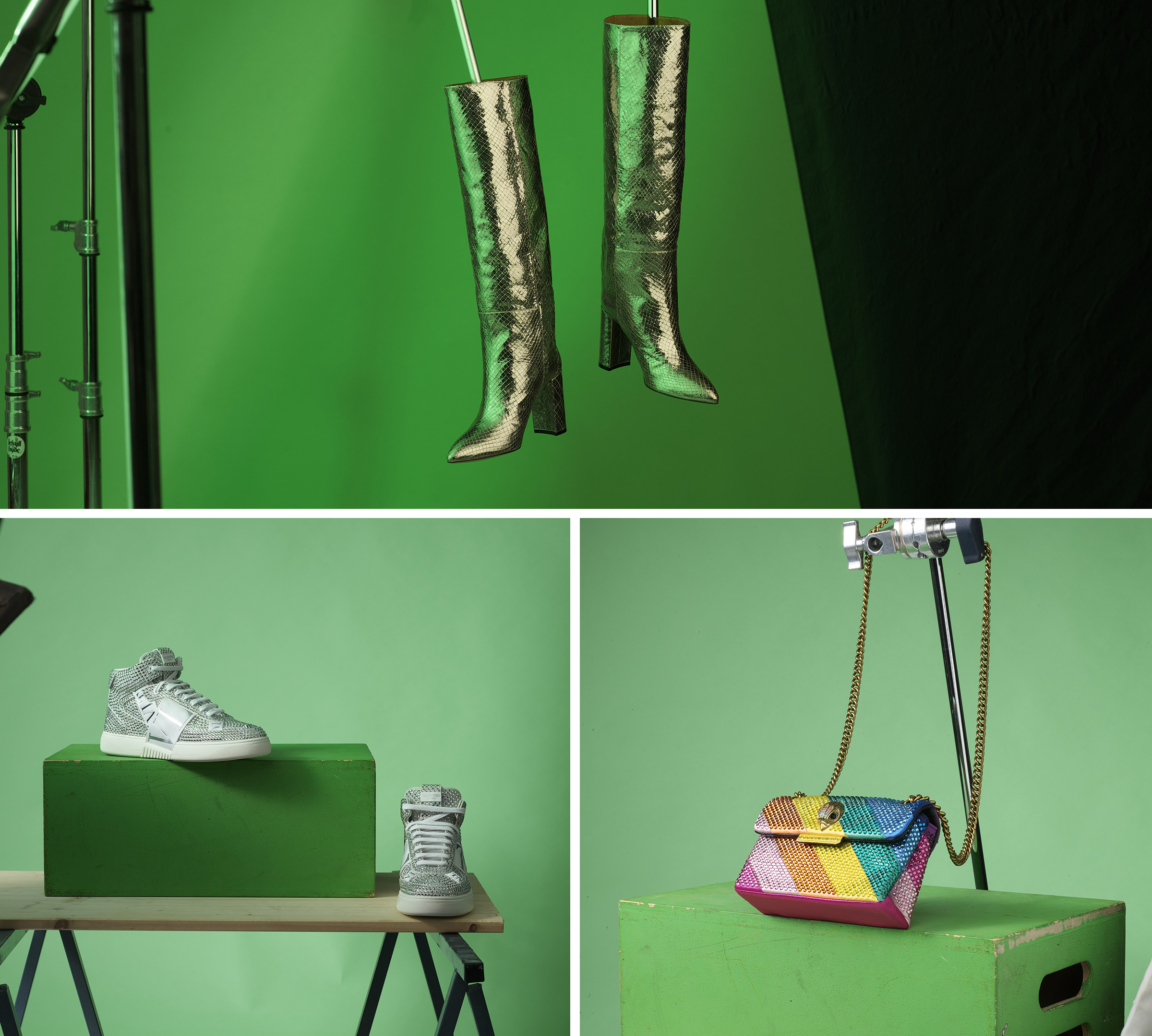
But this is a shopping experience right? So by no means would we simply display the products flat on the floor. They needed life and attention too so that they may also shine in our creative wildwood. We flew them first class, like the stars they are, to our studio in Brussels for an attitude heavy photoshoot. Happy to say that these divas now thrive in the thicket – you too would make a beeline for them!
/03 Concept
The Beeline
Upon landing on the Bijenkorf’s website, a bee resplendent with a thousand twinkly lights, flies across the screen and beckons you deeper into the woodland. You follow this wispy wondrous drone zigzagging between branches, exploring further and deeper into this new world. The soft and glittery powder she leaves in her wake makes you feel all floaty! Are you enchanted yet?
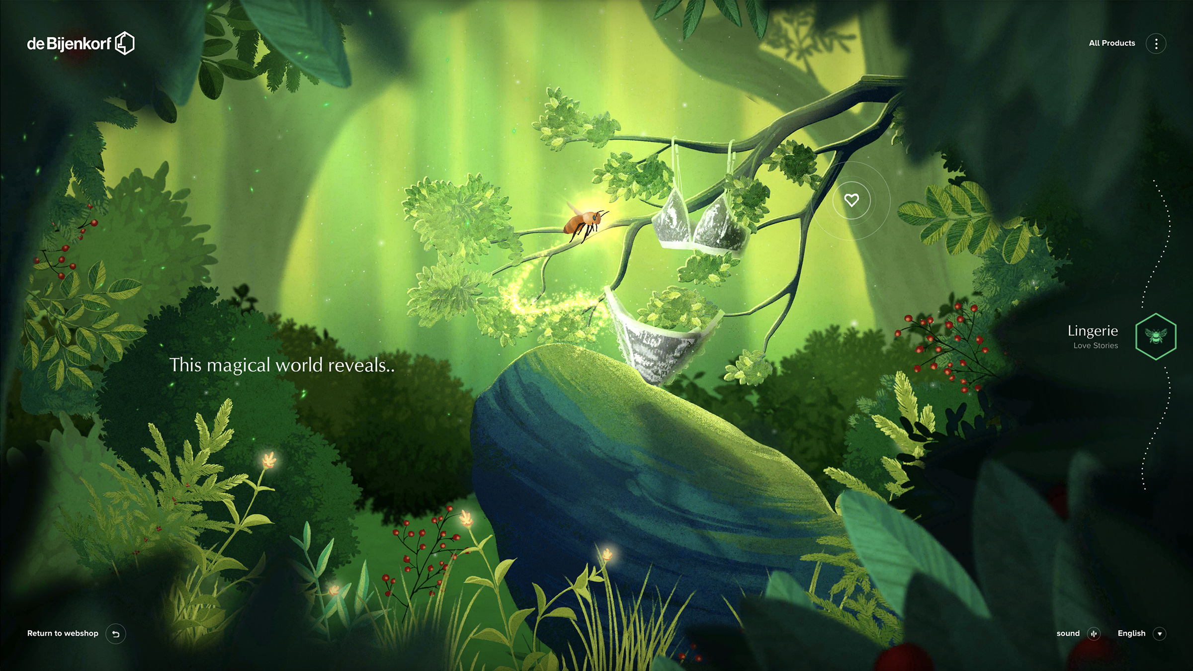
Our journey displays products one after the other across a linear, yet elevated magically, timeline. As you progress through the scene, we provide no options to directly jump to the following products. You are always guided wondrously, reinforcing the feeling of exploration. What’s your hurry? Take your time, our charming bee is the personal shopper of your dreams.


 English
 Español